New Work|New Material
Juror: Kelly Dietrick, owner, artist and operator of Troppus Projects in Kent, Ohio. Click here for bio.
FRESH 2021 JUROR’S STATEMENT
I selected the work for this show, as much as possible, by putting aside my own personal aesthetic and working to honor Summit Artspace’s annual intention to present a “Fresh” exhibition. In a time when anything is possible and anything can be art, that becomes ever more difficult to distinguish. Ultimately, upon reviewing the many submissions, it was my mission to make a selection that would present a wide range of modalities and aesthetics, and to think about the concept of the show in a really wide open way. This approach resulted in an exhibition that is quite diverse, but nevertheless has many unifying threads running through it. You’ll find painting, sculpture, photography, printmaking, jewelry, textile, wearable, mixed-media, digital, and time-based work. There is also diversity in terms of how the theme “Fresh” comes across in this exhibition. There are moments where “fresh” feels and looks like just that, and other moments where artists present a fresh perspective or take on issues that have remained more stagnant than one might have hoped, and so the work reflects that visually. While I felt strongly about selecting individual works that could also effectively participate in a conversation together and present interesting juxtapositions, I regret that this also of course meant that some really great artworks got left out. The message to all of the artists is, persist. As an artist myself, who regularly sends out applications, I am grateful for the opportunity to have considered the many submissions received. Tremendous thanks to Summit Artspace for inviting me to jury and participate in the curation of this annual exhibition of “Fresh” artwork.
If you are interested in purchasing any artwork from this exhibition please contact Heather Meeker.
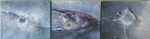
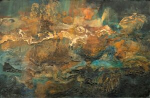
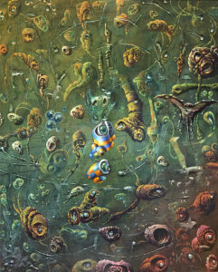
 FIRST PLACE "An Incalculable Loss" By Katie Butler


WINNERS
FIRST PLACE
Juror’s Statement: In many ways, this work at first feels like a rather traditional painting, made with oil and gouache on canvas, which is largely why it stood out to me. In other words, sometimes an artwork can concede to being traditional in some way, adhering to well established modes of making and still be fresh and timely and challenging. Afterall, we are operating in the 21st century when it’s been pretty well established that anything can be art. In this instance “new media”, rather than being an unexpected art material, is a current events headline – from the media. What I really love about this piece is that it seems to rely equally on representation and formal relationships to achieve a visually compelling and meaningful image.
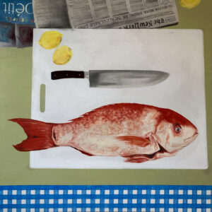
“An Incalculable Loss” by Katie Butler
Oil and Gouache on Canvas
48 x 48 inches $1000
Artist Statement:
Sitting at the intersection of painting and politics, this work deals with the challenges of disinformation, divisiveness and political turmoil currently facing the United States. Illogical shifts in perspective, curated moments of chance and elements of collage, either literal or fictitious, point to an era of anxiety, uncertainty and mistruths. In these still life paintings, fish are proxies for individuals in positions of power. They are freshly caught and on full display. Encased in the paintings, framed by knives and tumultuous headlines, there is a sense of trepidation, yet they remain intact. Patterns that allude to nostalgia, nourishment and domestic space reference the ways in which we find comfort in trying times. Objects are framed in a space that, through tilted planes, lacks rationality. There is a sense of familiarity and absurdity that exists simultaneously.
Areas of flat color, pattern, and objects sit side by side, each treated disparately. Space is distorted through flattened planes, multiple perspectives, and irrational scale relationships. A shape can act as both object and space. For a moment the viewer may stop to question what they are seeing, inviting them to think about fact versus fiction, or truth versus “fake news” in today’s media universe. This body of work explores the need for skepticism in an era of disinformation and the impact of the permeation of the news cycle into everyday life, seeking to cope with the current political climate in the United States through humor and narrative.
SECOND PLACE
Juror’s Statement: Visually, this piece embodies the concept of this exhibition with a certain brightness that I think we need right now, though conceptually I suspect it may not be quite so light. Utilizing found packaging materials to cast new pieces out of plaster, the artist uses the title to communicate a refreshing self-awareness about the elements of “not newness” in this artwork. Perhaps it’s just that, that this piece is as bright as it is dark, and as new as it is not new, that makes it so interesting to me.
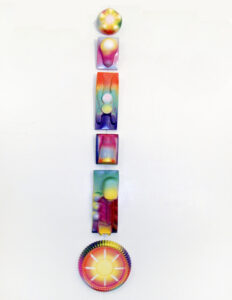
“I think someone’s already done this (for Brinsley)” by Roger Benedetti
Plaster, spray paint
Approx 6″ x 35″ $750
Artist Statement: I think someone’s already done this is a group of plaster casts using vacuum formed plastic packaging material as molds. Arranged in a line they suggest not a connected series of related totemic symbols representing something sacred or family/tribal lineage but a disconnected totem of the remnants of unrepentant consumerism. A totem for the contemporary age, and brightly colored as well.
THIRD PLACE
Juror’s Statement: As a piece of wearable art, this is a fresh take on self-portraiture that seems to sum up just how much our identity is tied to where we go/where we’ve been, and that hasn’t been much of anywhere for most of us lately. With an obvious reference to Mondrian, it seems to me that the use of color and geometry, and the attention to placement, as well as the cape’s function, work to highlight the impersonal or more collective experience. The application of the uniquely personal patch collection works like Mondrian’s very personal brushstrokes, imbuing the artwork with the self.
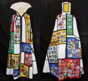
“Self Portrait, A life’s journey as told through great square inches of art.” by Judi Krew
Over 220 event and location patches collected since childhood, cotton fabric, thread, embroidery floss, zipper
36″ x 60″ NFS
Artist Statement: The patch cape is a wearable Mondrian inspired piece that displays one of my two different patch collections. Rather than T-shirts, hats, souvenirs and other such things, I collect patches which are becoming more difficult to find now. Some of these are from the 1960s, the World Trade Center patch is irreplaceable, Mao could not be purchased in the US at the time…as a patch designer myself, the art and design work is fascinating to me. They are truly “great square inches of art” . Much planning went into the location and layout of each patch on the color fields so as to best enhance details of their specific shape and color.
HONORABLE MENTION
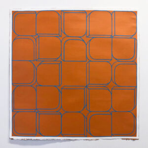
“Orange” by Catherine Lentini
acrylic on paper
15″x15″ $200
Artist Statement:
In my paintings, color functions as an experiential effect and shapes are shuffled slightly to highlight the paradoxical nature of the grid as a symbol for both the logical and the mysterious. As an undergraduate I studied both art and math, and in the process I became fixated on tropes of geometric abstraction and the elegance of pattern and configuration. While my work does not illustrate particular mathematical equations or principles, a large part of my interest in painting is rooted in a systematic approach. I purposefully immerse myself in the theoretical and historical implications of the tension between the logical and intuitive.
The piece I submitted to Fresh is part of a series of square paintings called Set. The series consists of smaller works on paper as well as larger paintings on canvas. Each painting depicts the same rounded rectangular prism motif situated in different intervals within a grid. Each painting is unique; no single configuration of shapes is repeated, and no color combinations are repeated in exactly the same way. The combination of uncannily similar paintings in different color combinations invites the viewer to activate the paintings by questioning and investigating their logic, not only within each painting itself but from painting to painting as well. The macro-structure of the series is defined by a slightly three-dimensional cube shape with one rounded edge situated in different places within a grid. The paintings are then grouped together as sets within sets. The grid structure is interrupted with blank space, which reveals the slight three-dimensional quality of the shape. Thus, the image is made up of shapes cobbled together like bricks, as opposed to one flat pattern. Though the paintings in this series do not portray patterns in the traditional sense of a flat motif repeated at certain intervals, they function like a pattern in how they operate according to a system within a particular framework, the grid.
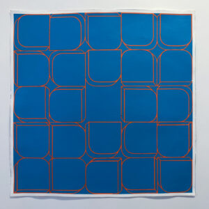
“Blue” by Catherine Lentini
acrylic on paper
15″ x 15″ $200
Artist Statement:
In my paintings, color functions as an experiential effect and shapes are shuffled slightly to highlight the paradoxical nature of the grid as a symbol for both the logical and the mysterious. As an undergraduate I studied both art and math, and in the process I became fixated on tropes of geometric abstraction and the elegance of pattern and configuration. While my work does not illustrate particular mathematical equations or principles, a large part of my interest in painting is rooted in a systematic approach. I purposefully immerse myself in the theoretical and historical implications of the tension between the logical and intuitive.
The piece I submitted to Fresh is part of series of square paintings on called Set. The series consists of smaller works on paper as well as larger paintings on canvas. Each painting depicts the same rounded rectangular prism motif situated in different intervals within a grid. Each painting is unique; no single configuration of shapes is repeated, and no color combinations are repeated in exactly the same way. The combination of uncannily similar paintings in different color combinations invites the viewer to activate the paintings by questioning and investigating their logic, not only within each painting itself but from painting to painting as well. The macro-structure of the series is defined by a slightly three-dimensional cube shape with one rounded edge situated in different places within a grid. The paintings are then grouped together as sets within sets. The grid structure is interrupted with blank space, which reveals the slight three-dimensional quality of the shape. Thus, the image is made up of shapes cobbled together like bricks, as opposed to one flat pattern. Though the paintings in this series do not portray patterns in the traditional sense of a flat motif repeated at certain intervals, they function like a pattern in how they operate according to a system within a particular framework, the grid.
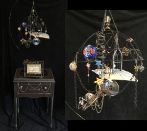
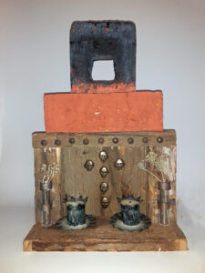
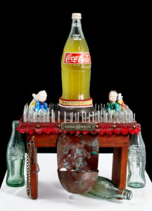
“Miss Lily’s Fabulous Flying Machine” by Luanne Bole-Becker
Assemblage (reclaimed and new metal, wood, plastic, glass, fabric, paper; acrylic and enamel paint)
24″ wide x 18″ deep x 76″ high $750
Artist Statement:
This piece celebrates several of my deep loves:
– Vintage–often mundane–objects, reclaimed and repurposed to emphasize their unique craftsmanship and visual interest
– Adventure and imagination, particularly captured in a steampunk style
– My first grandchild, Lily, born in September 2020
My hope is that a viewer’s momentary interest will lapse into longer periods of discovery and perhaps inspiration. I think Miss Lily would appreciate that! She lives in the machine, you know.
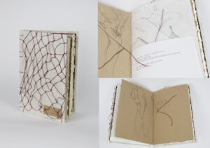
“When I was you” by Claire Bowman
Artist book, with hand-knotted net
6″ x 9″ NFS
Artist Statement:
One of the most uniting experiences of humanity is our connection to our physical body. While they come in a plethora of variations, we all have a physical form that we must use to understand the world around us and get us through our daily lives. For women in particular, this experience can have an even deeper unifying force, caused by continued methods of societal objectification, both obvious and subtle. We often learn from each other how to look at ourselves, judge our own bodies based on how we see friends and family objectifying themselves, so much so that our understanding of self becomes intrinsically tied to the other women around us. It is this connection that I am expressing in this book, particularly how I have come to understand both my body and myself through my relationships and some of the women in my life.
For this piece, I wanted to create a very intimate experience for the viewer as they went through the book. It is about subtlety, self-evaluation, and the way this serves to connect us even more deeply. Pencil illustrations of both myself and several women from my life are interspersed with my own poetry on dealing with doubt, self-loathing, and eventual healing. The various paper types give a sense of variation and change from page to page, the soft, tactile experience giving an even more intimate relationship between the book and the viewer, while representing the multitude of different stories and moments that I and the women around me are joined by. A hand-knotted net is featured on the cover, the curving, uneven lines of the thread mimicking the illustrations within, while also representing both a sense of entrapment, as well as connectedness — just as every knot helps tie the entire net together, each experience or relationship in my life serves to help better define me as a more fully-realized human being. And lastly, but most prominently, is the red thread stitched through the entirety of the book. As a more direct symbol of connectedness, this string is physically tying together these words and these women, showing that they are all joined as one. Just as the “red string of fate” supposedly unites soulmates, this red string unities me with the women of my life, showing that I cannot begin to understand myself, without also understanding my connections to them.
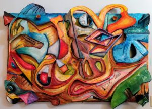
“The Gate” by Cornelius
Plaster, wood , layered joint compound, Oil paint
(48) wide (35) high NFS
Artist Statement: The name of the submitted piece is called the Gate.. It is a piece that is the beginning of a started series of relief plaster artwork. I’ve just begun the second, third and fourth statuesk pieces, all of which are layered in plaster, concrete mix ( sheetrock) and painted in oil. There are several catagories that fit this piece, I consider myself to be a Abstract Expressionist, although I also paint in a host ot of established styles modern through aboriginal.
“Dark Crystal” by Brett Drummond
Digital on Canvas
20″x30″ $300
Artist Statement: Crystals have many facets, reflections and vortices. This piece attempts to show the viewer how art is created in the natural world. Allowing for the viewer to open up and see the many potentials inside of them. Furthermore, the viewer might even have a transcendental experience and see that they are a crystal themselves, being shaped by the everyday pressures of life.
“Qtkee” by Shirley Ende-Saxe
Mixed
11×23 $600
Artist Statement: All objects here are things that have been cluttering my studio for 20-30 years, I liked the way they came together.
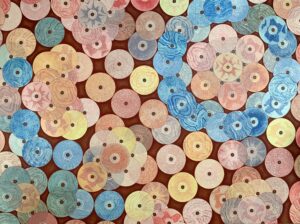
“Things Will Surely Come Around” by Meryl Engler
drypoint on CDs, colored pencil
48″x36″ $600
Artist Statement: Intaglio printmaking can be an unattainable medium. It involves chemicals, expensive materials and metal and lots of equipment. Artists have been seeking to make intaglio more accessible by using plexiglass plates that are scratched into like a drypoint. This past year, I discovered CDs can be used in this way, scratched into and then printed. I loved that using CDs was both resourceful and environmentally friendly while providing the challenge of working with the shape of the circle. I created an organic mosaic-like pattern by collaging all of the prints together so they formed a tile wall. I think the repeated use of the circle is indicative of my experience this year towards the end of summer when the days blended together and nothing seemed to change in my day to day life.
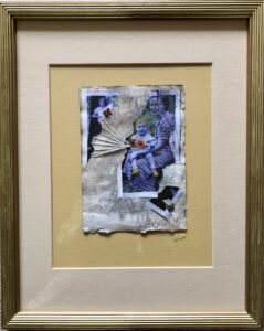
“Golden Boy” by Care Hanson
Collage, pen, pastel, ink & hand stitching on natural dyed paper
5”Wx7”H (framed 12”Wx15”H) $225
Artist Statement:
I’m very fortunate to be in a stage of life conducive to honoring creative whims. Art play is never a chore, and the variety in scale & medium keeps it forever fresh.
In early September I cooked up a rusty acorn dye bath for a bundle of papers & vintage photos ~simply because I’d discovered a crop of huge acorns.
In October I began using the dyed papers as substrates for small collage stories, perhaps in response to my mother’s unexpected death on September 22. They were completed one by one and grew into a series of 14 titled ‘Rough around the Edges’
‘Golden Boy’ was number 8 in the series. The ‘adopted ancestors’ in the collage tell a story of motherhood, pride, protection and separation. The stitching and torn pieces speak of both connection and loss.
“The Last Memorial” by Kenn Hetzel
rammed earth w/pigment, wood, various material
15″h x 8″d x 9.5″l $250
Artist Statement: As this year has progressed with political absurdity and the ravages of Covid-19 the thought of our demise I am sure has entered the minds of many. As it crossed my mind, I began thinking what a last memorial to us/mankind might envision. It would be simple and temporary made of found objects. The breakdown of this piece is as follows: the reddish block of rammed earth was dyed to resemble a blood-stained soil and our demise, the charred wood signifying what we eventually left behind, the base made up of over one hundred year old wood relates to the past with the remaining items candles and holders, withering flowers in empty vessels and a cross made out of skulls to the failed belief in religion, God and ourselves.
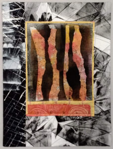
“TRIPTYCH : ART SPACE” by Carol Klingel
acrylic on photograph on canvas
30” x 8” $400
Artist Statement: While gallery sitting on the third floor over many years, I have amassed myriad photographs of the aged, cracked, and gorgeous old concrete floor. Some cracks remind me of outer space, a view from an airplane, or the microcosm contained inside a body. These three photographs wanted to be joined and hand colored, so I obliged.
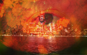
“The Eye of The Beholder” by Sarah Kosinski
photograph
11×14 $120
Artist Statement: During my time in quarantine, I have played around with abstract photography a lot and in that, I made a small group of works. All of which are based around the cities we build to move forward in life but also how well kill so much natural beauty to do so. The meaning of these photographs may not be clear to the viewer at first because of their abstract nature, but every photo uses an image of a cityscape and a landscape or flowers and occasionally a face or eyeball. But in the end, even though all the photographs look different in their own way they all have the same message behind them.
“Still Standing” by Joanna Mack
fabric printed with inks,sewn after layering
14″ wide by 17.5″ high $150
Artist Statement: Ravaged, imperfect, but still there – a fair summary of 2020.
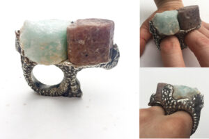
“sterling silver sand cast aquamarine and ruby ring” by Kristina Malcolm
sterling silver, ruby, and aquamarine
3″ x 2″ x 2″ NFS
Artist Statement: I strive to elevate the perceived limits of metalsmithing into the realm of fine art through design, passion, and pushing the limits of time-honored techniques. I am submitting a small body of work, all of which were created in 2020. Each work is distinctive yet made painstakingly by hand with traditional silversmithing techniques. This piece is quite a feat of engineering. It starts with a three thousand year old technique called Sand Casting where special, fine grained sand is moistened with mineral oil and pressed into a mold. For jewelry scale objects, the sand is pressed into a cast iron frame, which is then carved with small hand tools to create a chamber. Then, a funnel like chute for the molten metal to flow into the chamber is added to the mold and the mold halves are paired together. As soon as the molten metal comes in contact with the sand and oil mixture it immediately burns, which means it is a one use only mold. In the case of this ring; recycled, re-purposed, and reused sterling silver was melted and poured into a cavity which contained traditional, yet uncut gemstones. This mold was unique in that the rough and raw gemstones were left in the mold instead of being set after casting. As the chamber is filled with molten metal, gravity pulls the metal around the stones and when the metal cools, it locks the stone in the metal. Casting stones in place is a relatively new method as it has only been within the last one hundred years that it was discovered there were stones that were strong enough to withstand the heat. There are only three varieties of stone that are strong enough to do this. This piece is unique because of its aqueduct or architectural like appearance. When a sand mold is carved it is very difficult to anticipate what the final product will look like because you are carving the negative space of what you are visualizing the finished piece to be. To create this piece, I started with the stones, noticing matching cleavage planes and let them dictate the form, focusing specifically the top flat plane of the raw crystals and the matching planes on the side.
“Changes” by Amber McElreath
Mixed media collage
8”H x 10”W x 2”D $150
Artist Statement: This piece is about the delicate balance between the man-made and the nature-made. It’s about animals attempting to adapt and sea levels rising. While we are focused on the pandemic, sequestered inside our homes for the necessary protection, it is incidentally diverting attention away from solving the greatest existential threat we face.
“Lovebirds” by Fred Pierre
Multi-layered digital composite created with GIMP software
18″ x 36″ $140
Artist Statement: Lovebirds was created in 2020. Lovebirds is a photo collage made up of bird and floral themes. It’s a valentine for lovers everywhere.
“Keep It Between the Lines” by Pollock Youngpole
Spray Acrylic
30′ x 40″ NFS
Artist Statement:
This piece was inspired by quilts that I have seen. As a trained drafter I have always liked geometric images that incorporate strong lines and with this piece I wanted to keep the lines as clean and straight as possible which wasn’t easy. The bright color contrast wants to jump the boundary lines much like the temptations in life. While the blue in the piece provides a resting place. The wrinkled rectangular orange area near the center of the piece wasn’t planned. While laying down the paint this particular area wrinkled. This was really perplexing because it was the only area that gave me any issues. I repainted the area multiple times trying to fix what I perceived as an error. In fact, it was struggling with this rectangular area and trying to keep the lines razor sharp that ultimately gave rise to the title. Which came from a country song by Lonnie Shelton. In the song there is a line where a man’s boy asks him to color in his coloring book. The man indicates that he hasn’t colored for a very long time. The boy tells him “All you have to do is keep it between the lines”.
Pollock Youngpole (AKA L.A.Pinkus)
August 2020
“Pandemic Drawings” by Erica Raby
Mixed-media (watercolor, marker, graphite, and gel pen) on paper
40″ L x 12″ H $300
Artist Statement: My work consists of mixed-media drawings, collages, and installations that expose anxieties, uncertainties, and the overall fragility of our world currently. Often I use found materials that are compulsively collected and saved—including post- consumer waste. These materials become transformed and arranged in a delicate temporal manner as I contemplate their accumulation within our culture. Throughout both ways of working I use playfulness, discovery, and experimentation to arrange the compositions. Utilizing and manipulating post-consumer waste in my work enables me to maneuver through the anxiety stemming from my environmental concerns. This process is at time meditative and can provide a release for my unease. Although the work may appear to be naively constructed and simple at times, it requires a closer contemplative understanding of the relationship between the materials and oneself.
“Cliff Dwelling” by Carol Stevens
acrylics
30″ X 20″ NFS
Artist Statement: After years of accumulating too many Golden acrylic products, it was time to experiment with them all. Cliff Dwelling has 12 different products applied randomly, then color. I never expected to make anything of it until I saw the stratified rock along the highway as it cuts through the the mountains of WV on our annual winter drive to FL and imagined all the tiny creatures that live in those crevices.
“Radiation” by Katherine Stokes-Shafer
Mixed
24″w,19″h,11″d. $400
Artist Statement: This piece was created on the frame that anchors one’s head to a table for radiation. I cut into the frame to symbolize the destruction of one’s body and emotions when going through cancer. The exterior image is created from recycled material to add a femine look. On the inside is an image of a real person. I wanted to create a contrast between the real and the imagined.
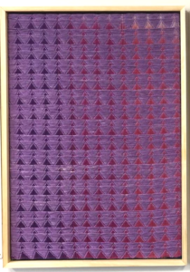
“Untitled (purple waffle)” by Stephen Tornero
Cotton, Linen
30″ x 40″ $500
Artist Statement:
I am inspired by colors I find in nature and how they interact with artificial colors of electric light. Many of the pieces I create begin as photos I take while driving to different areas of Ohio. The different combinations of sky, clouds, and stop lights create color schemes that I use as a starting point when dying the yarn used in each weaving.
In this artwork I was inspired by my experimentation with a “waffle weave” structure, traditionally used to make towels and linens, to create large graphic triangular shapes. Using different shifting colors in the background allowed me to play with the interaction of the large, textural pattern on the surface. This piece was created with linen yarn traditionally for making table runners, and a heavy cotton yarn, mostly used for making mops. This yarn was hand dyed and woven into a new form, sublimating these traditionally useful items into an artwork.
“In The Realm Of Forms And Archetypes” by Andy Tubbesing
Acrylics, metallic powder, expanding glue
24w X 30h $1000
Artist Statement: What is it about the “essence” of redness and the “existence” of apples that send guys like Plato and Church Elders and Jung off the deep end? Is there really a difference at all? A quest is in order, to the inaccessible plane nonexistent Essences. We must reveal their ultrareal Truths, the infinite superiority of pure Redness to mere apples.
“the joke” by Gwen Waight
Found object assemblage
18”x16”x10” NFS
Artist Statement: This piece is called the joke and is in response to a childhood racist joke I had to endure a lot.
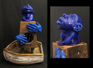
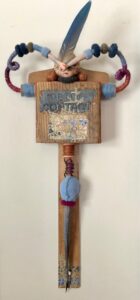
“Blue(s) Man” by Jeff Willis
Wood, clay, and ink
16” x 23.5” x 10” $450
Artist Statement:
The idea for Blue(s) Man began as a primitive and visceral sketch that haunted me for years. I never quite knew what to do with it until I added the third dimension. Forming it with clay, suddenly it had life; it made sense to me. Although I had been working with wood for a while, combining it with clay and metal fragments reminded me of the constructs that I made as a child.
His blue skin is a reference to a dark complexion as well as the emotions that most immediately come to mind. Paired with a version of an old cigar box guitar, the figure points to blues music. The boat is a reference to water. Water is often used in blues lyrical tradition to describe the desire to travel home. (Home can be a place of rest, a city of origin, the African continent, or even Heaven.) Together, these elements create a nostalgic, melancholy mood that echoes the music that inspired it.
See the Summit Artspace exhibit schedule for show details.
Have questions? Here is our Frequently Asked Questions page.
Please Note: All exhibits are subject to becoming virtual at our website, summitartspace.org, due to the global pandemic.