Celebrating over 150 years of service, the Akron Area YMCA is a powerful association with a shared commitment to ignite youth empowerment, improve overall health and well-being, and demonstrate the importance of connections within our community. The Y ensures that everyone—regardless of age, income or background — has the opportunity to learn, grow, and thrive.
In that spirit, Summit Artspace is honoring the organization’s milestone year by inviting artists to create pieces that include the letter “Y” in any way. Whether literal, hidden, or abstract, Akron-area artists share their Y story. Join us to reflect on yours.
If you are interested in purchasing any artwork from this exhibition please contact Natalie Grieshammer.
Juror’s Statement
Juror: Sharon Frank Mazgaj, Artist
The “Art of Y” is purposely an ambiguous idea, meant to be interpreted however the artists chose to do so. This exhibition is a nice collection of artworks created in a wide variety of genre, media, and style. Some of the artist’s work literally depicted the letter “Y” as their subject, others used the Downtown Akron YMCA building to represent, and others went with a more abstract idea of what the YMCA or what some other “Why” means to them.
I thought all of the work in this show was interesting, at the very least. Trying to figure out the “Y” or the “Why” in each of the pieces was intriguing. It was also fun to get in each artist’s head and figure out how and why they created what did.
Click here for Juror’s Bio.
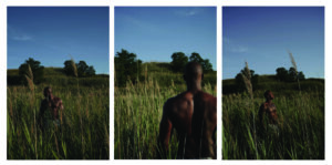
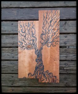
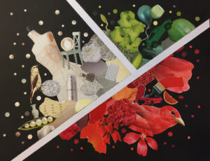
 Why Ask Y by Catherine Wooley


Winners
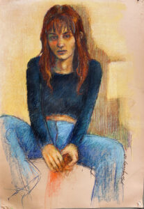
1st Place
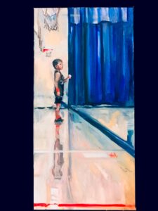
“The Y” by Emily Kohmann
Oil
$1200 12″x24″
Juror’s Statement: There are so many wonderful things going on in this painting! First off, the composition is very powerful. The large curtain blocking one corner, the lines on the floor, the figure’s reflection on the shiny floor and the basketball hoops in the background all draw our eyes to the boy on the sidelines. I like that there is just enough detail to perhaps recognize the boy if you knew him, but he is not so detailed that the painting is a portrait of one individual. Anyone who has ever watched a child play in a sport has witnessed this quiet moment right before the activity on the playing field. The limited color palette unifies the scene, and while the style is highly representational, there is a lovely looseness to the brushwork, giving it movement and interest. The artist shared that this is her kindergarten son, at a YMCA, wearing a jersey that says “The Y”. In her artist statement, she says “I love this sport, I love this boy, that’s the why.” Everything comes together in this piece to make it a perfect representation of both the YMCA and “the why”.
Artist Statement: This is an oil painting that was inspired by a (favorite) photo of my son, Brady, playing kindergarten basketball at the North Canton YMCA last year in 2020. He is patiently waiting at the opposite end of the court while his team brings the ball down. He is a beginner. The blue curtain dividing the court is a staple of YMCA basketball and something I remember from childhood. The red sweatband on his wrist matches him to his opponent on the other team- a fun & clever way to teach the kids who you should be guarding on defense. He is nervous, my sweet quiet boy. He smiles at me. Printed proudly on the front of his jersey are the words “the Y”. I love this sport. I love this boy. The “why”.
_________________________________________________________
2nd Place
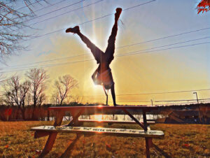
“Y NOT” by Stephanie Leonardi
Photography
$365 SIZE
Juror’s Statement: I love that this photograph looks like a quick, unplanned shot where everything just happened to line up perfectly, but I’m sure the artist visualized and planned the whole thing. The viewer recognizes the sheer athleticism of the figure doing a one-handed handstand, then realizes his body is creating a very obvious “Y” shape. The sun radiating around and behind him and the limited color palette gives us that sense in time of a late afternoon in a park, playing around and having fun. The picnic table becomes a pedestal, drawing our attention to the figure, and filling out the composition. The artist shared that she took the photo at Summit Lake in Akron, which is recognizable in the background. The graffiti on the seat of the table is part of a quote by Robert Kennedy. All of the elements in this photo give us a sense of joy, warmth and positivity.
Artist Statement: I literally saw the call for artwork, the call was the question, the art of why, or Y, was it a question? My mind kept circling back to it, trying to creatively solve what I could show or produce with that question. I love that space! When ideas roll around and you sift through them trying to picture the perfect image and the perfect words until finally you can see it, and its real, and all that’s left is to go create it and make it a reality!! The idea, yes a youth doing a one handed handstand in the shape of a Y, the idea, yes, sunset, yes, silhouette, city skyline??? Or Summit Lake!? Well when you live in Summit Lake and hang out with kids you can have a hang out time/ photo shoot… I’m not sure who had more fun, me or them, so many awesome pics, BUT this is the one I envisioned. With a portion of Robert Kennedy’s quote on the bench real subtle like its graffitied on it, and almost a bold proclamation from the youth posted up ON ONE HAND! Y NOT?
_________________________________________________________
3rd Place
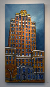
“150 Reasons Y” by Lisa Thomas
Acrylic, Avery labels, glazing medium
$400 30″ x 15″
Juror’s Statement: I loved this cropped view of the downtown YMCA, executed in a stylized, almost cartoonish manner. The tree’s trunk in the left-hand corner forms a playful “Y” shape, and we see enough of the building to recognize it. The artist has painstakingly added 150 positive words to the building, which makes the viewer want to find and read each one. In her artist statement, she says she thought about the 150 years the YMCA has been operating, and how many stories that building must hold.
Artist Statement: I studied the YMCA building and thought to myself, how many stories, within over 150 years, are in this building? So I came up with 150 reasons “Y” this noble building holds many memories for its community. The process of my artistic creativity involves looking past the obvious traits of the subject itself and [insert what you do after looking past the obvious].
_________________________________________________________
Honorable Mention
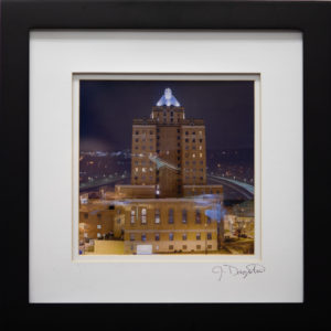
“Akron’s Ys” by Joe Dagostino
Film Photography
$250 14″X14″
Juror’s Statement: The artist has found a way to include two of Akron’s most iconic images; the downtown YMCA building and the All American Bridge, popularly known as the Y-Bridge. While both of these places are not in close proximity to each other, he’s super imposed them together, creating an interesting composition. The light shape of the Y-Bridge curving back into the center of the building and the lighted top of the building keep the viewer anchored in this scene. The use of images from night time creates a mysterious, otherworldly sense of space.
Artist Statement: This image represents the Y’s of Akron, the YMCA and the “Y” Bridge. Utilizing a double exposure done in camera. The Image was shot on film and traditionally printed in the darkroom.
_________________________________________________________
Honorable Mention
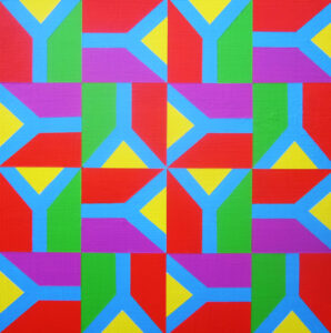
“Y Design” by Diane Pribojan
Acrylic on panel
$180 12″ x12″
Juror’s Statement: I loved how the artist created this piece with the simplest of ideas; the letter “Y”. The artist used vibrant colors, and places the Y squares side by side, turning them different ways. The viewer can look at this piece several different ways. We can see many squares, or the four in the center, or the outside framing the inside. This piece falls between an Op Art and a Pop Art style of painting, which makes it very interesting.
Artist Statement: In a world of infinite ideas using the letter “Y” is a very broad subject. I made a deliberate choice of using a repeat pattern as a design for the letter “Y”. Repeat design has always intrigued me. One of the highlights of repeat design is the surprise element once the modules are connected: a new pattern emerges.
_________________________________________________________
Honorable Mention
“P.S. I Love You (2019)” by Art x Love
Collaborative mural and time lapse video
NFS
Juror’s Statement: I appreciate all the work involved with conceptualizing, organizing and executing such a concept. I love that the artist found a way to engage a community and lead them through the art experience. I think it’s a fantastic idea to encourage people who do not think of themselves as artists to create something.
Artist Statement: The P.S. I Love You collaborative mural was created to differentiate and amplify attendee’s experience at this special 5k walk/run in Middlebury. Participants of all ages and abilities were encouraged to step in wet paint and walk across the mural surface. Once complete, stickers were removed to reveal the logo and realize the vision of “a lasting impression.” Art x Love produced the summary video of the project to show the various steps (pun intended) of the mural’s creation.
_________________________________________________________
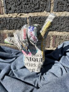
“Celebrate Y” by Jennifer Allshouse
Wire, paper mache, glue, plaster, newspapers, wood
$50 6″x6″
Artist Statement: This is a 3 dimensional sculpture of a hand making the letter y In American Sign Language. I then decomposed/college words that came to mind when u think of the YMCA. What it mission is and what it offers to the community.
_________________________________________________________
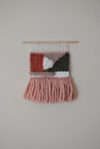
“The Woven Y” by Abegail Bricker
Fiber art
NFS 12″x13″
Artist Statement: Weaving is a meditative process that allows for the space to consider how individuals and communities interact with one another to create spaces for growth. The Woven Y contemplates the mission of the YMCA and explores how the strands of community, anti-racist principles and inclusivity combine to form a strong foundation for all people to pursue their best selves.
_________________________________________________________
“Y… not” by Patrick Dougherty
Chalk pastel
$400 36” x 30”
Artist Statement: I love drawing in every medium… particularly in chalk pastel. I share this passion with my students, exposing them to as many different mediums as I can afford. There’s so many great artists … Degas, Delacroix, Lautrec, Kitaj … who have worked in this wonderful medium. One has no problem knowing where to look for inspiration.
_________________________________________________________
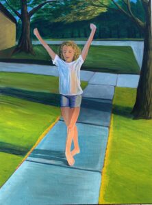
“Warm Summer Memories” by Noelle Eibler
Acrylic
$300 18”x24”
Artist Statement: This painting depicts my daughter. We like to go for walks around our neighborhood. I often capture these times on camera. I loved how the sunlight made her skin glow that summer evening as the sun moved low in the sky. That moment reminded me of my own treasured memories of my own carefree childhood summer days in the golden sun. My objective in this painting was to capture the warmth of that moment.
_________________________________________________________
“Moving forward” by Jennifer Eisenberger
Acrylic on canvas
$150 16″x20″
Artist Statement: I used acrylic paint on canvas! I love using bright, bold and vibrant colors! I enjoy painting abstract art.
_________________________________________________________
“Blissful” by Jennifer Eisenberger
Acrylic on canvas
$150 16″x20″
Artist Statement: I absolutely love to create abstract art. I am drawn to bright, fun and vibrant colors! I hope you enjoy what I have created!
_________________________________________________________
“Dark Skin of a Summer Shade” by Imari Evans
Pigment on paper
NFS 12” x 16”
Artist Statement: This photo was taken one very sporadic and warm summer day, last year, in the midst of the coronavirus pandemic. I was feeling unmotivated, restless and emotionally exhausted by the racial events and issues that were taking the nation by storm, centering the murder of George Floyd. It’s a fact that black skin and culture is so magical and sought after, yet, we’re one the most oppressed races in the world. Photographing it and turning it into art is my way of “show & tell” through a lens and camera body. Black skin has always been my favorite type of canvas. It’s a subject I know best.
_________________________________________________________
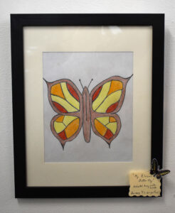
“My Elusive Butterfly” by Sharon Gillig
Colored pencil
NFS 9″ x 7.5″
Artist Statement: My artwork pertains to my love for butterflies, and I thought I could implement many Ys in my drawing. I named it after the song Elusive Butterfly, which was popular in 1966. My sister was killed in a car accident that year and whenever I hear the song it reminds me of her.
_________________________________________________________
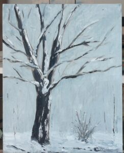
“Rest” by Holly Gramling
Oil on canvas board
$50 8″ x 10″ without frame, 13″ x 11″ framed
Artist Statement: This piece embodies my love of the four seasons and the beauty of all. Watching the maple tree outside the studio window turn from summer to fall to winter symbolizes the “Y”. Seasons of life, growth, and rest are imperative to the human condition.
_________________________________________________________

“Distortion” by Isabelle Hahn
Acrylic paint on canvas
NFS 10″h x 16″h
_________________________________________________________
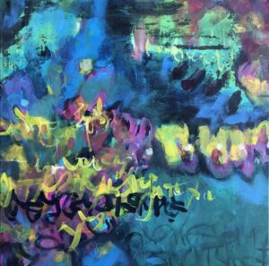
“It’s my Love Language” by Care Hanson
Acrylic on gallery wrapped canvas
$300 20” x 20”
Artist Statement: Asemic writing fascinates me. Lines and symbols that look like writing, they are in fact wordless and devoid of meaning in any recognizable language. When faced with asemic writing, I can feel my brain attempting to decipher a message. But ultimately, the viewer must bring the meaning, a message to fill the vacuum. In this painting, asemic script is layered over an ambiguous abstract, an ‘almost’ landscape or water scene. (There may be a ‘y’ or two to be found). The viewer’s interpretation completes the narrative. The title and colorful palette are hints of joy.
_________________________________________________________
“Twisted Tree Balance” by Kimmy Henderson
Enamel paint on wood
$175 12″ x 21″
Artist Statement: Vision for my art is heavily influenced by spending much time in nature with my family. With a focus on trees and botanicals. Inspiration for my current work stems from my personal struggle with Bipolar 1 disorder, PTSD and Generalized Anxiety Disorder. I find the uplifting manic as well as the disastrous chaos are reflected in my body of work. I am using my experience and signature Bipolar Butterfly design to raise awareness and help end the stigma on mental illness with the visual representation of the Bipolar Butterfly and public art installations. Hoping to change the future for my genetically predisposed children and their entire generation by normalizing comfortable dialogue to address mental health and seek help when needed.
_________________________________________________________
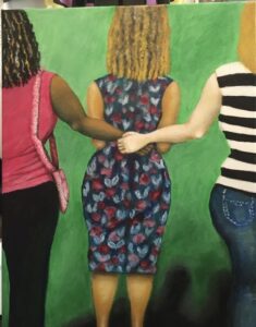
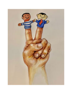
“Come Play with Me” by Kristin LeFever
Mixed
$120 12″X16″
Artist Statement: This is my first submission for a juried show. I am a beginning painter and committed to myself and my friends that I would submit for this call. My painting is a playful representation of friends and community space, two things I think of when I think of the Y.
_________________________________________________________
_________________________________________________________
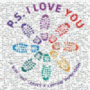
“P.S. I Love You (2020)” by Art x Love
Digital Mosaic
NFS
Artist Statement: The P.S. I Love You mosaic is a collage of photographs Art x Love refined to generate a graphic mosaic in the image of the P.S. I Love You logo. The mosaic features hundreds of images of participants from the 2019 and 2020 P.S. I Love You 5k walk/run. A life-size poster of the mosaic will go on display in Middlebury later this year.
_________________________________________________________
“P.S. I Love You (2020)” by Art x Love
Time lapse video
_________________________________________________________
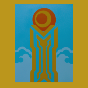
“Tower Of Y” by Brittany Luciani
Spray Paint on Canvas
$300 18″ x 24″
Artist Statement: This piece was inspired by the art deco features on the YMCA building. The tower is composed of several Y’s and the colors chosen represent the warmth and hospitality of the YMCA.
_________________________________________________________
“RedWhiteGreen” by Norman Mallard
Found images on watercolor paper.
$250 9″ x 12″
Artist Statement: Using found images, this piece fairly explodes with its three monochromatic fields emanating out from pure white onto pure black. Norman’s background in graphic design shapes his bright, yet wry, view of the world, both celebrating and mocking consumerism and social constructs.
_________________________________________________________
“Soaring Ys” by Keiichi Minatodani
Acrylic, Watercolor Mixed Meida
$1200 33″ x 43″
Artist Statement: Love being an artist.
_________________________________________________________
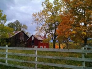
“Hidden Y at an Old Barn” by Brad Nellis
photograph
NFS 12.5″ x 10.5″
Artist Statement: I took this shot while out driving my elderly mother around to see the fall leaves in the Cuyahoga Valley a few years ago. I recall the day vividly; it was beautiful out and the fall colors were peaking. This barn caught my eye as we drove past so I pulled over and took a few shots. My mother passed away in early 2020 and this picture is a happy reminder of a wonderful day we spent together. And for the “Y” in the image, it’s not hard to find at all…
_________________________________________________________
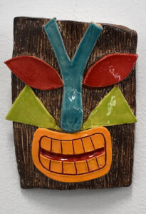
“Takoda the Tiki” by Sophia Lada Novak
Clay-fired, painted, ceramic
NFS 7.5″ x 5.5″
Artist Statement: I made the tiki because it reminded me of summer. I made this during the cold months of winter, but summer is my favorite season, so I wanted to make something that would remind me of summer both in the process of making it and when the piece was finished. I really enjoy putting texture in my art, and I really enjoyed carving into and adding onto the tiki. I love art, especially ceramics, because it doubles as an outlet for my creativity and my engagement of the senses since I am a tactile learner.
_________________________________________________________
“Friends at the Y” by Barbara Perkins
Acrylic painting on canvas
$150 14” x 18”
Artist Statement: During these uncertain times it’s always rewarding to be with friends whenever possible. To have a safe place to enjoy their company while sharing good times is priceless.
_________________________________________________________
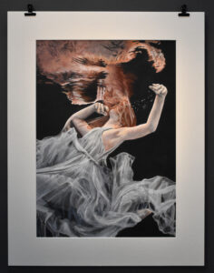
“Abyss” by Maddie Powell
Acrylic on paper
NFS 21″ x 15″
Artist Statement: Abyss belongs to my series of works which explores finding and accepting yourself after years of struggling. This piece is about losing yourself in the midst of chaos. The woman is submerged in water, darkness surrounding her as she faces a decision: give into the darkness or fight for freedom. Her face is hidden as she feels ashamed of how low she has sunken. I wanted to create a melancholic tone yet still leave it up to the viewer to decide whether the piece signifies the beginning of a new chapter or the end of a long journey.
_________________________________________________________

“The Y in the Sky” by Janean Ray
Digital Photography
$85 16 x 24 Foam Core Board
Artist Statement: Just like this C17 that delivers troops and cargo, provides strategic transport of personnel and equipment worldwide and provides aeromedical evacuation, so does the YMCA, in providing global aid. Within ten days of the declaration of World War I, YMCA had established no fewer than 250 recreation centers, also known as huts, in the United Kingdom, and would go on to build temporary huts across Europe to support both soldiers and civilians alike, run by thousands of volunteers. During World War II, YMCA was involved in supporting millions of POWs and in supporting Japanese Americans in internment camps. In addition, YMCA was one of seven organizations that helped found the USO.
_________________________________________________________

“Yankee Doodle Dandy” by Janean Ray
Digital Photography with enhanced filtering effects
$85 16 x 24 Foam Core Board
Artist Statement: Starting before the American Civil War, the YMCA provided nursing, shelter, and other support in wartime in the USA. Within ten days of the declaration of World War I, YMCA had established no fewer than 250 recreation centers, also known as huts, in the United Kingdom, and would go on to build temporary huts across Europe to support both soldiers and civilians alike, run by thousands of volunteers. During World War II, YMCA was involved in supporting millions of POWs and in supporting Japanese Americans in internment camps. This included helping young men leave the camps to attend Springfield College and providing youth activities in the camps.
_________________________________________________________

“Hooray for Women – It’s a Magical Night” by Janean Ray
Digital Photography
$85 16 x 24 Foam Core Board
Artist Statement: Taken at the Battle of Magicians at the Canton Palace Theater Jania Taylor, who is also “Lady J” at Yankee Peddler, ends her spot onstage with a rousing ‘Thank You’ to the audience. Jania, being one of few female magicians, has always had to battle in the man’s world of illusion. Jania’s pose at the end of her performance reminds us of the battle all women face in all walks of life and the ultimate salute of accomplishment. Even though the YMCA started originally for men, the YWCA soon followed and worked towards the empowerment, leadership and rights of women. The global YWCA movement has long supported gender equality and human rights. The YWCA is involved in the fight to address and end violence against women, has provided safe spaces to women and girls since its founding in 1855 and provides support to victim survivors and at-risk individuals through crisis, health, housing, legal services, safe spaces, and advocacy. This work continues to this day, both in person and virtually and is one of the largest providers of domestic violence programs and shelters in the United States.
_________________________________________________________
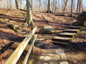
“The Wise See Whys and Ys” by Debra A Schinker
Photography
$149 11″ x 14″
Artist Statement: In 1844, London was a dangerous world of tenement housing and risky temptations – and a hub for young rural job-seekers. Twenty-two-year-old George Williams and 11 friends organized the first Young Men’s Christian Association (YMCA) as a refuge from the dangers of street life. Although an association of young men meeting around a common purpose was nothing new, the Y offered a unique mission: working together to meet the community’s social needs. Fast forward 90 years. The Works Progress Administration (WPA) was established in 1935 to employ millions of people, out of work after the Great Depression, to complete public infrastructure projects. Across the country, the WPA had a profound and long-lasting impact on nearly every American community – an impact still felt today. For example, these stone stairs in Akron’s Cascade Valley Metropark were built by the WPA and in daily use after 78 years. Despite the sustained positive impact of WPA, it was roundly criticized by Republicans as a Democratic ploy to buy votes and funnel money to undeserving people. But Roosevelt knew that people want to be part of something bigger than themselves and that they are stronger when they work together to create lasting value for their communities. Both Williams and Roosevelt were precient. They WISELY saw the bigger picture of dignified work for a common purpose – the “WHYS” of both the YMCA and the WPA. Look closely at this image – then look again. How many representations of the letter Y do you see?
_________________________________________________________
“Peace and Unity” by John Sharp
Watercolor and Colored Pencil
$100 11′ X 16″
Artist Statement: The “Y” represents a place of peace and unity for children and the community. I wanted my piece to illustrate that and a place where a child could find a friendly smile.
_________________________________________________________
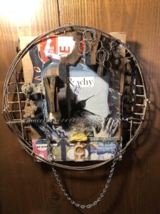
“Why?” by Gwen Waight
Found object assemblage
$125 15”x10”x2.5”
Artist Statement: This piece uses found objects and collage to ask the question why? Why aren’t women safe? Why do men have their hands, eyes, etc on women’s bodies? Why?,why?why?!
_________________________________________________________
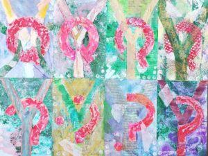
“Why Ask Y” by Catherine Wooley
Paper, Paint, Nylon Mesh
$500 15″ x 18″
Artist Statement: “Why ask Y” is a reaction to the often asked question for artists about why they create their work. This question is especially true for viewers that expect realistic or cartoonish images. This work mixes common alphabet letters and punctuation marks, pushing them visually forward and back. The viewer relates to the eight rectangular sections using their own reference points. The Q morphs as it moves through the work. The Y stays central in each quilt like piece though it obscures somewhat. This obscurity answers the question “Why ask Y?”
_________________________________________________________
See the Summit Artspace exhibit schedule for show details.
Have questions? Here is our Frequently Asked Questions page.
Please Note: All exhibits are subject to becoming virtual at our website, summitartspace.org, due to the global pandemic.