19th Annual FRESH Juried Exhibition
Betty and Howard Taylor- Main Gallery
Juried by Michael Gill, Executive Director and Editor of Collective Arts Network (CAN) Journal, the annual FRESH juried exhibition challenges local artists to push the boundaries of what art can be—stylistically, conceptually, and technically—and challenges the viewer to see the world through a new lens.
Special thanks to FRESH exhibition partner:![]()
Juror’s Statement
The challenge of Fresh—to push the boundaries of what art can be— is a big one, both in the context of the times and within the practice of any individual artist. How does art evolve, and how does an individual practice evolve, and how do we push ourselves and each other? For most artists, this is a constant pursuit. What can we do that is new? How can the things we make relate to the world, and matter? One of the ways that happens is through the materials use, and the way they intersect with the times. Does the medium speak to the time? Is it derived of the time? How does it relate, either inherently or in the way the artist uses it? In choosing this show, I focused on medium and material and the ways they inform the artists’ work.
This is an incredibly varied show, not only in the media and the mix of media, but in the perspective of the artists. There’s abstract intrigue, urgent concerns, and topical provocation, and plenty in between. And you have plenty to gain by taking a close look at each piece. I love the way the show came out, and glad to have you see and consider these works.
Thanks to all the artists who applied to be a part of this show. Without individual artists, we would not have all this substance that enriches our lives. And thanks to Summit Artspace for creating the platform for the artists to show their work, and for people to take a look. It has been a pleasure playing a role in this year’s iteration of Fresh.
– Michael Gill
Executive Director
Collective Arts Network
Special thanks to Bradley Hart, Summit Artspace resident artist, for photography of virtual exhibitions!
Did you know?
Most of the artwork on display at Summit Artspace is for sale.
Click on the artwork images for pricing and more information about each piece.
If you would like to purchase any art, please visit a staff member or volunteer at the front desk, or email natalie@summitartspace.org.
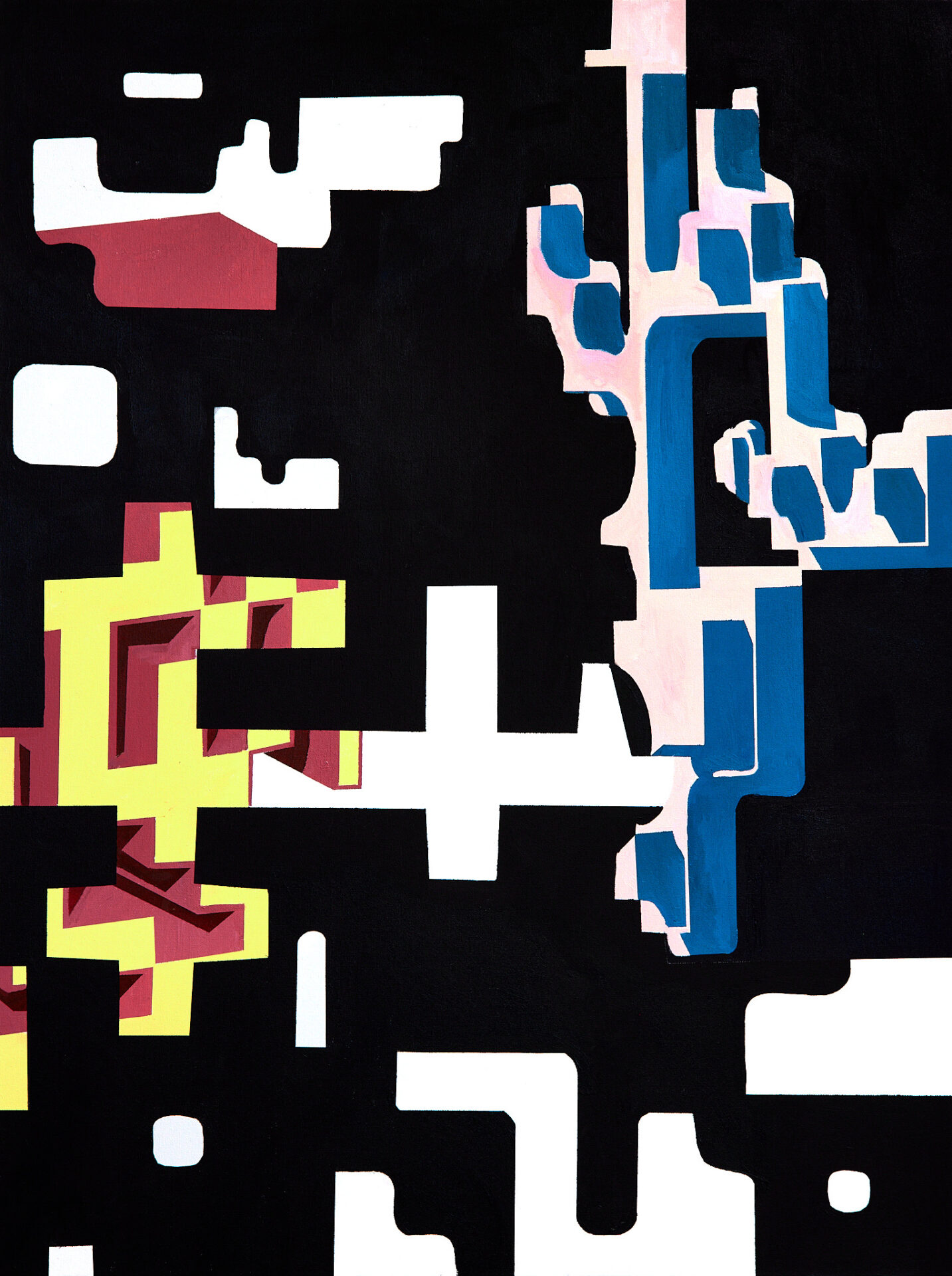
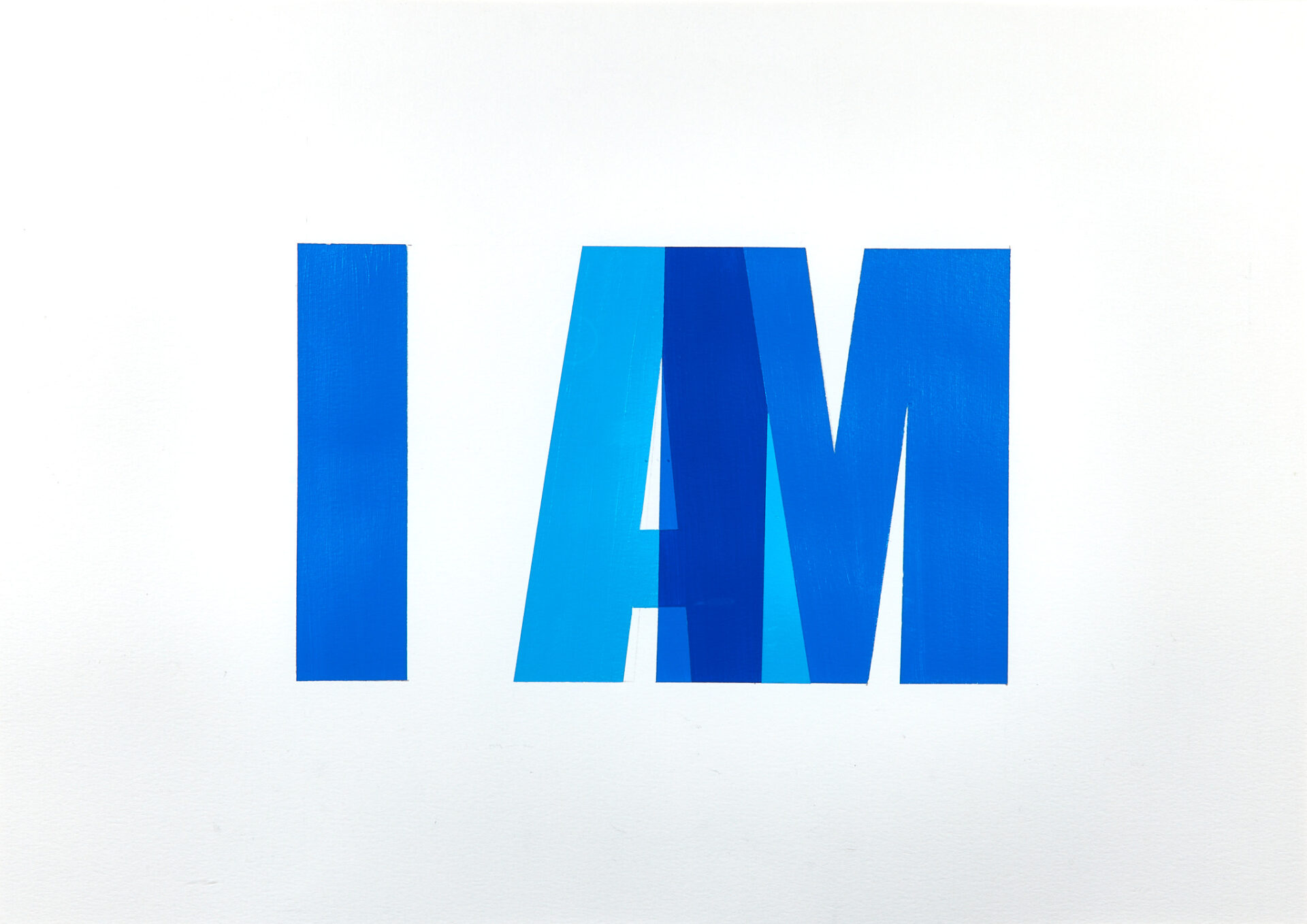
1- Diane Pribojan | The Word | $500
Acrylic on paper
25″ x 31″
Artist’s Statement: I use my surroundings as an inspiration for my work. With this I am constantly seeking something within me that expresses what I am thinking and feeling as well as including the interpretation of the world around me.
Artist’s Bio: Diane was born in a small village in the Former Yugoslavia called Zvjerinac. She moved to the United States with her family when she was three years old. Although, she loved making art as a child, it was not until high school that she became passionate about making art, so she went to the Cleveland Institute of Art and received her BFA and then her MFA in painting at Kent State University. In her work Diane finds inspiration in her immediate surroundings and continues to pursue her passion by painting and exhibiting her work.
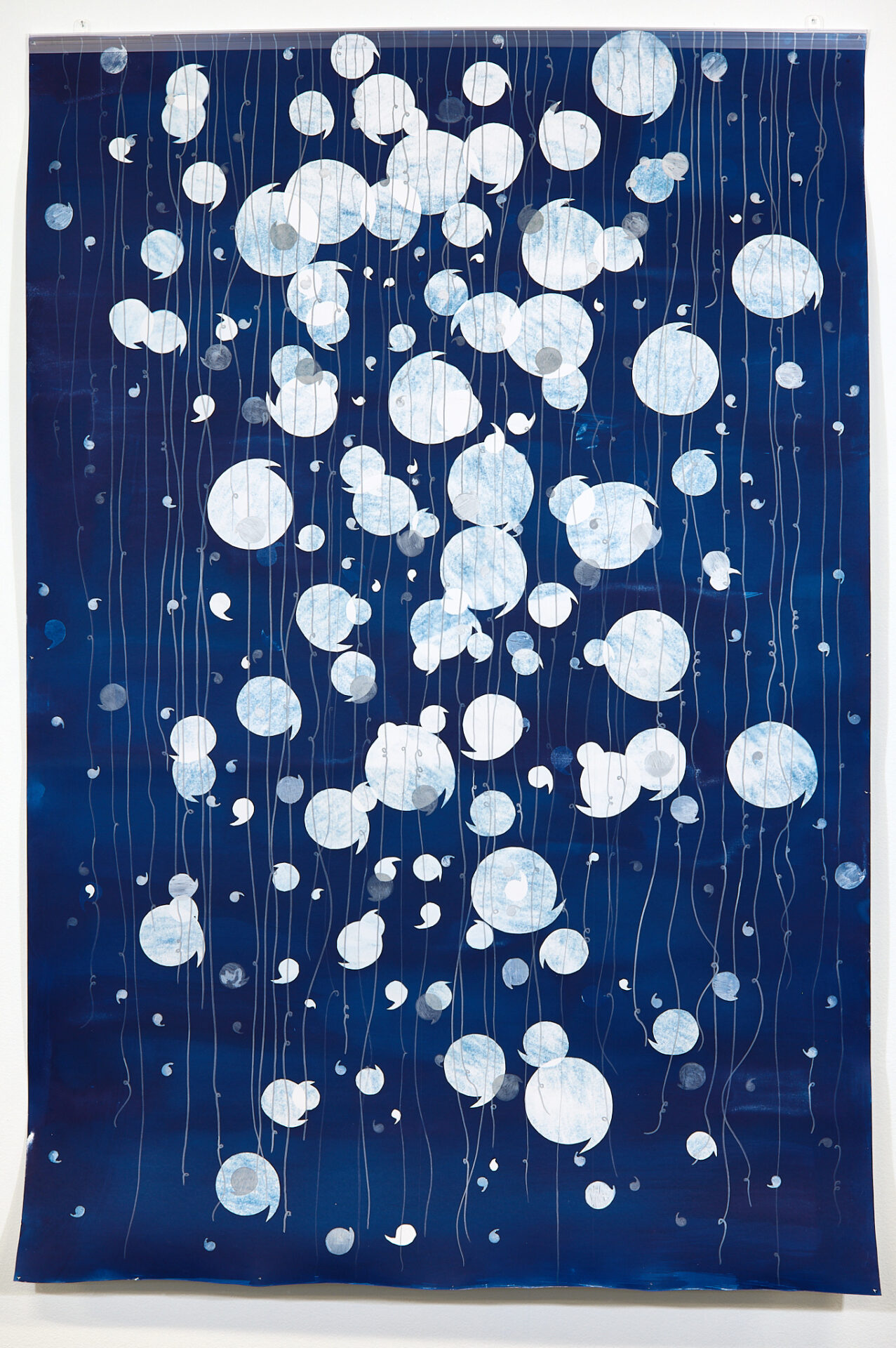
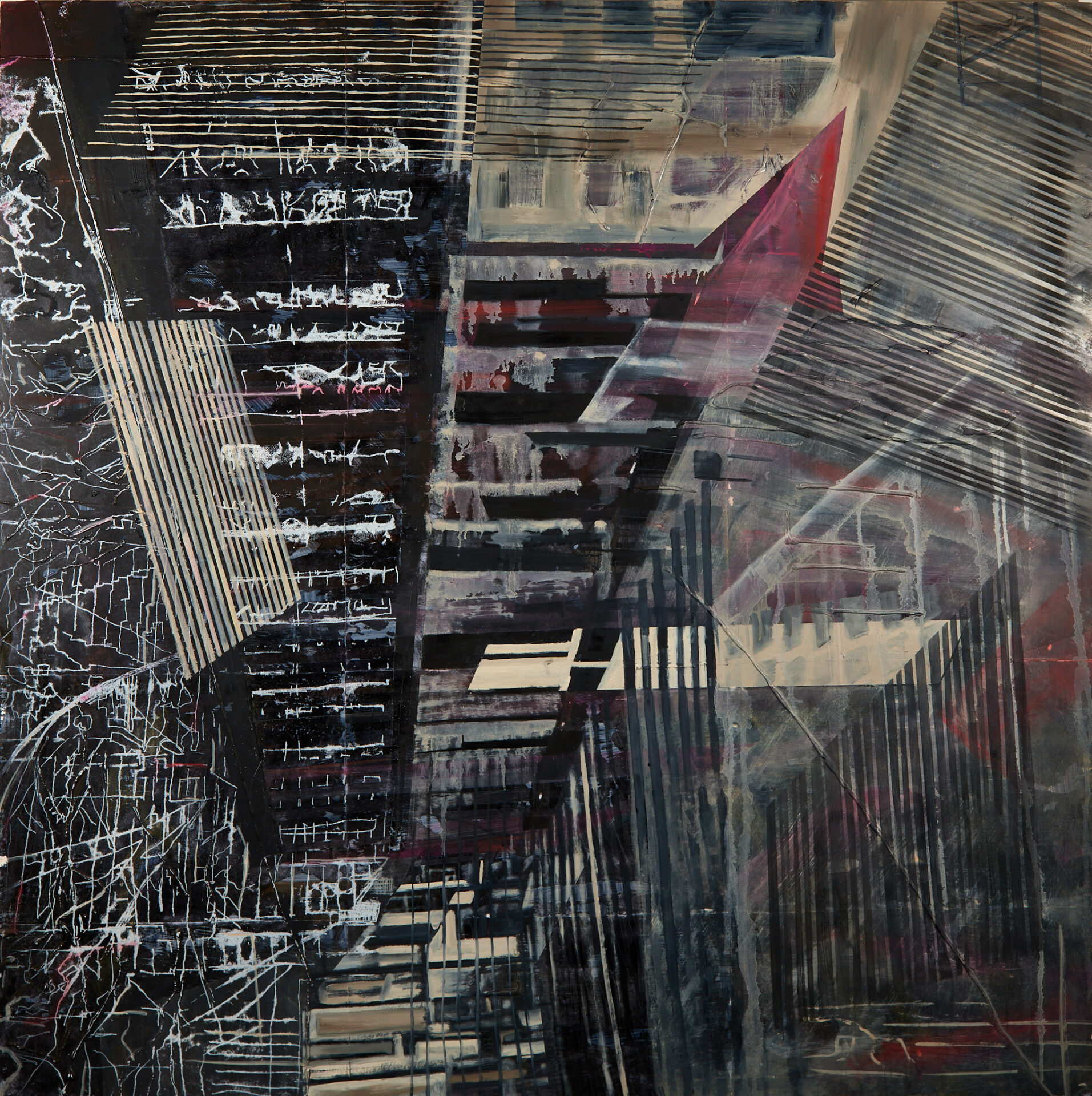
2- Steven Mastroianni | Comma-tosis Series #11 | $2,000
Cyanotype and ink on paper
60″x40″
Artist’s Statement: My work focuses on the intersection of drawing and photochemical processes with a series of photograms & photogenic drawings rendered in silver gelatin, cyanotype, and ink. The images straddle the abstract and surreal, drawing from the subconscious, as well as a formal and playful exploration of unique motifs and patterns. Evocative of watery depths, imaginary heavens, and mysterious maps, these luminous images create an immersive dimension with their own rules of scale and space. Like dreams, these objects seem familiar but weird; letters that don’t exist, mechanical forms floating in dark space or deep water, math problems that don’t add up, and patterns that follow their own logic of space and dimension. I want to challenge viewers on a visceral and creative level, to engage with them in the joy and energy of the imagery and patterns.
Artist’s Bio: I am a Cleveland based artist, photographer, educator, curator, and musician. My art straddles the worlds of drawing, photography, and printmaking, incorporating drawing and camera-less photographic processes. My commercial photography work includes portraits, events, and editorial photography. I am also a college professor and guest lecturer in photography.
From 2008 until 2018 I was the owner and curator of Silver Scuro Studio and Gallery (formerly Mastroianni Arts), a gallery and studio space, where I exhibited the work of area artists and other arts related events.
I have exhibited in numerous solo and group shows, curated dozens of exhibits in my own gallery, and have served on many exhibition juries. Most recent exhibitions include a solo show at Massillon Museum, Artist Residency at Akron Soul Train, and several curated small group exhibits at University Hospitals, Photocentric Gallery, and The Cleveland Printroom. My work is included in many private and corporate collections, including Progressive Insurance, University Hospitals, and The Cleveland Clinic.
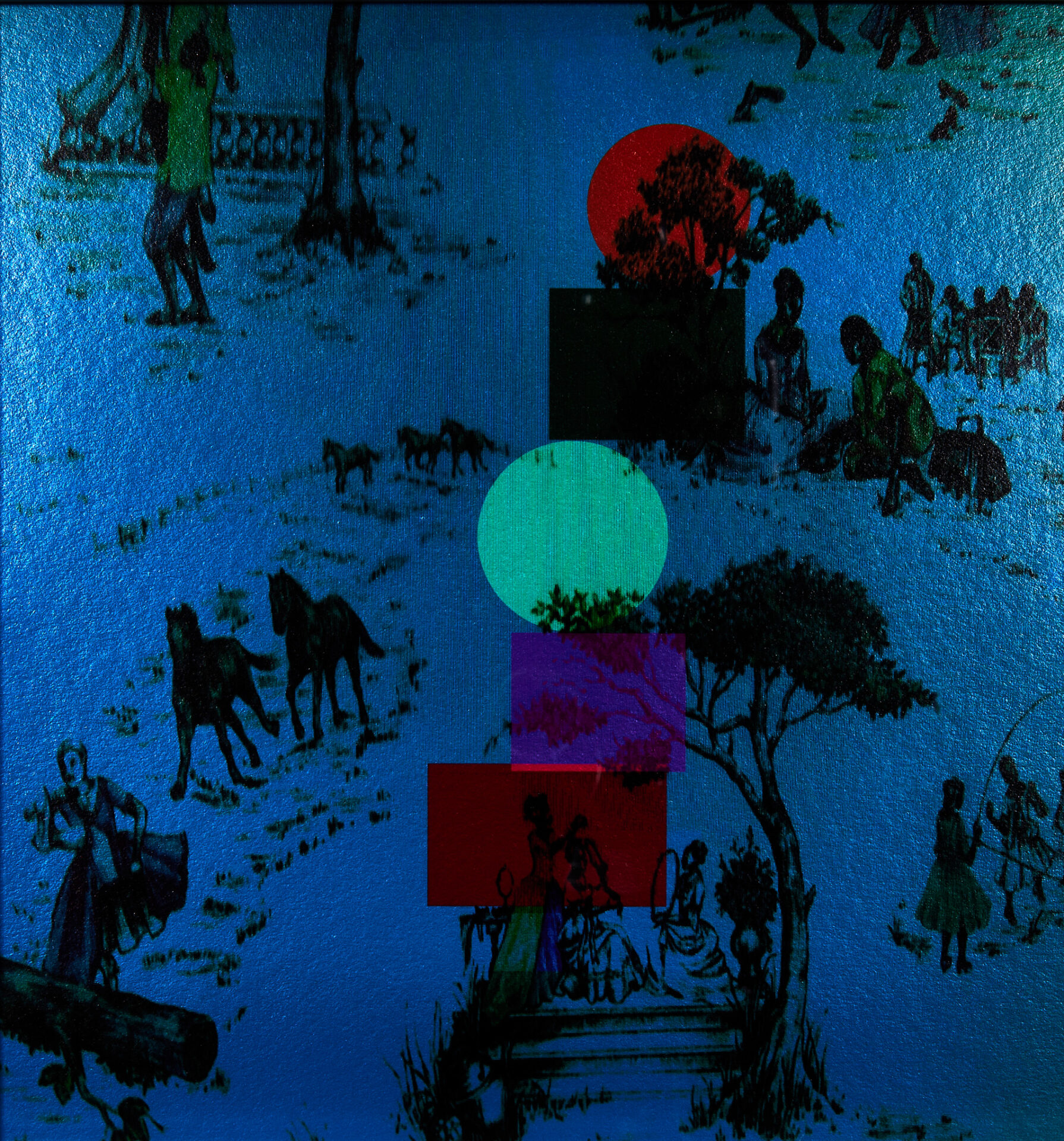
3- Rita Montlack | The Leaning Tower of Toile de Juoyful | $600
Archival digital print, computer manipulated
11″ x 14″
Artist’s Statement: The Leaning Tower of Toile de Jouyful is an example of my current obsession with bringing vintage wallpaper & fabrics into the future! All colors have been changed & The Leaning Tower emerged to add more joy to the already robust scene!
Artist’s Bio: Rita Montlack, a Cleveland native, has a distinguished career as a professional artist. Her work has been shown nationally in dozens of solo exhibitions, including gallery exhibitions in New York City and Miami, as well as scores of juried group shows, in which she has received many awards and prizes, including, most recently, the “Architecture Prize” at the national FAVA Biennial Photography Show 2021 and the “Jon Logan Purchase Prize” at the CAN triennial 2022. Her work is included in prominent institutional collections, such as those of Case Western Reserve University, Cleveland Clinic, Cleveland State University, Cuyahoga Community College, MetroHealth, Progressive Corporation, and University Hospitals. Her current work grows out of her own photographs that are subjected to various interventions on the computer. Subverting things that are familiar and creating matches that do not match are things that Rita is passionate about.
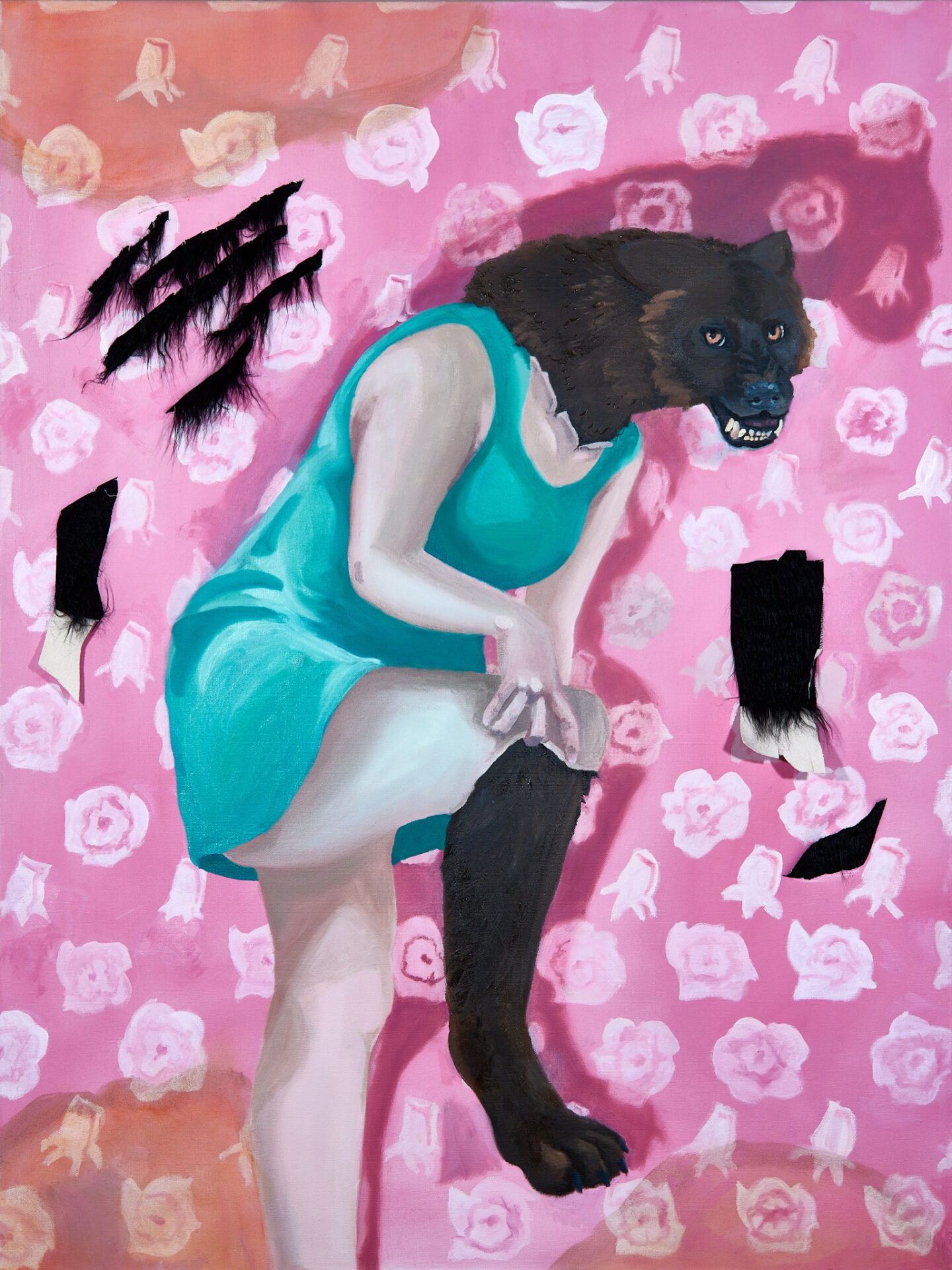
4- Moriah Clay | Beastly | $300
Oil paint and faux fur on canvas
36″ x 48″
Artist’s Statement: This painting is based on the feeling of dysphoria for transgender man. As one tries to repress their trans self and live as a cis person, the dysphoria will slowly eat its way through the person until it can no longer be ignored. This is evident in my painting through the transformation of the person because he was trying to be feminine. Even his surroundings are transforming as he can no longer hide who he is. Dysphoria can make you feel disgusting or like a monster. The werewolf transformation shows this as well as acting as a general allegory for transitioning.
Artist’s Bio: Mo Clay is an artist born and raised in Canton, Ohio. He is attending the University of Akron for a Painting and Drawing BFA. This BFA will be obtained in Spring 2022. Clay is most interested in nature themes, but he is also interested in social statements in art. He uses primarily his own photographs as reference to create paintings that highlight the artistry of nature. Clay paints both natural and figural artworks. Many of his artworks have been created to make a statement. These statements have related to current societal issues such as climate change and LGBT rights, but also mental health and stress.
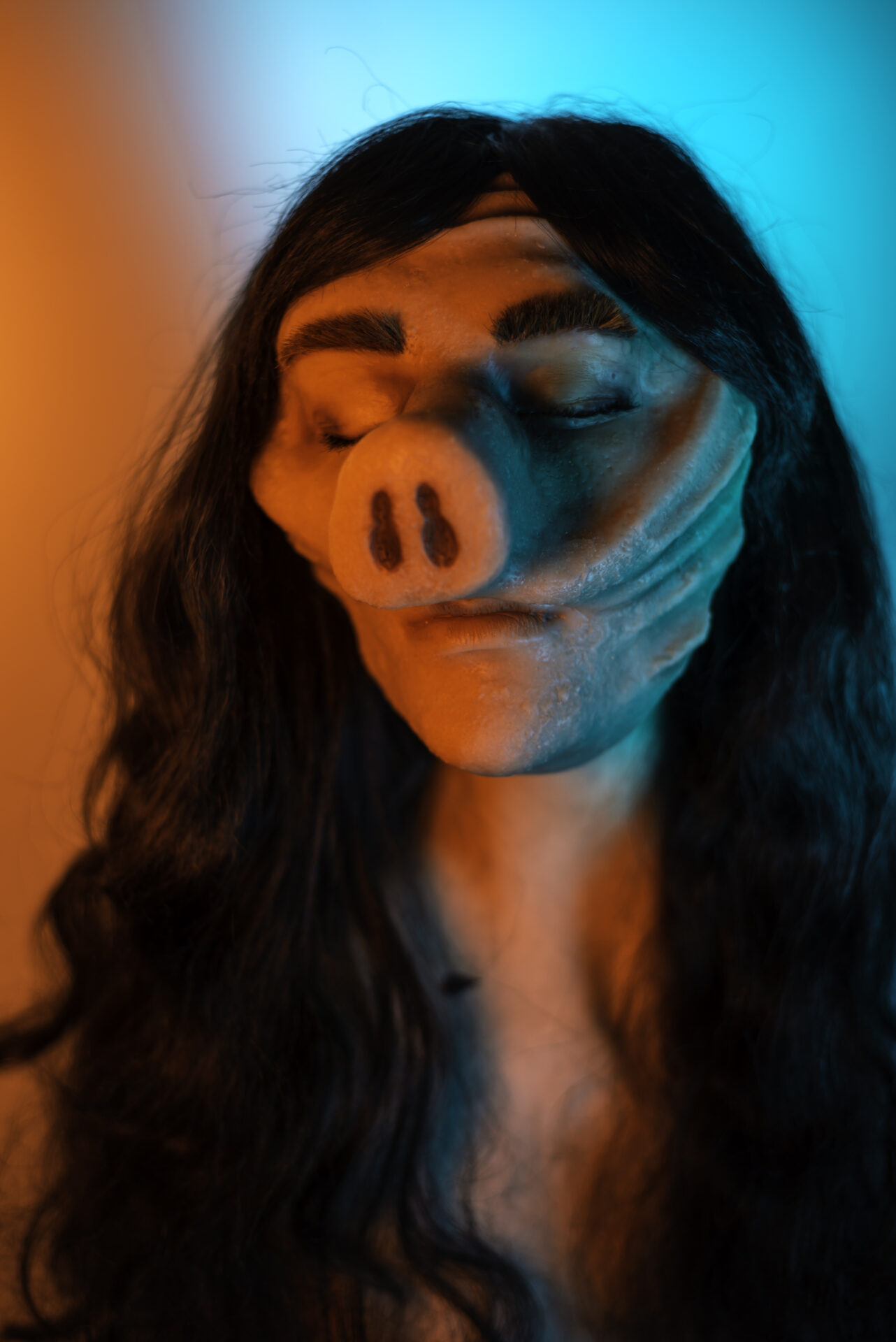
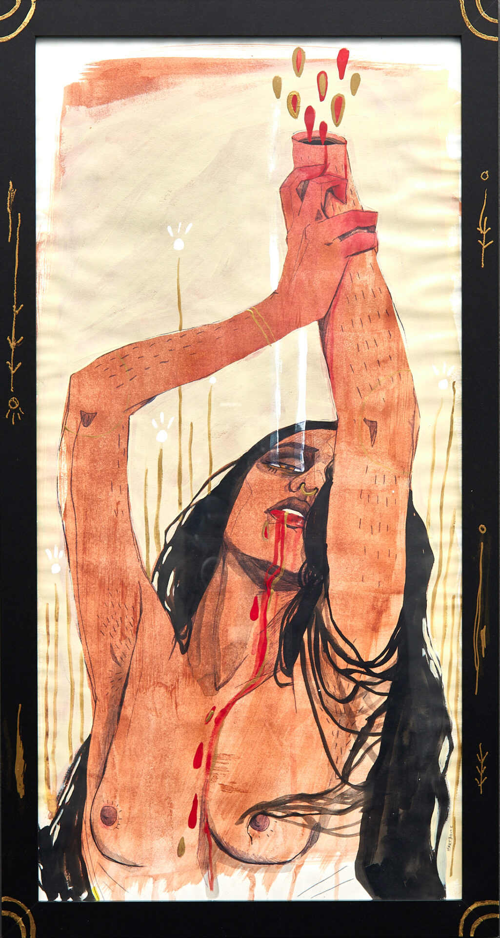
5- Anna Young | Beauty is in the Eye of the Beholder | $500
Digital Inkjet Print
24.25″x30.25″
Artist’s Statement: This photograph is based on the “The Twilight Zone” episode “Eye of the Beholder”. This is a silicone mask I created, embellished with synthetic hair and makeup, and photographed. Beauty is in the eye of the beholder, it is subjective.
Artist’s Bio: Anna E. Young received her MFA in Photography from Cranbrook Academy of Art in 2018. She received her BFA in Photography from The University of Akron with minors in Printmaking, Art History, and Professional Photography in 2014. She is the co-owner of KINK Contemporary, an exhibition space in Cleveland, Ohio. Young currently works at the Massillon Museum as an administrative assistant and social media manager. She lives in Cuyahoga Falls, Ohio, and focuses her practice on the ideas of anxiety, aging, and mortality.
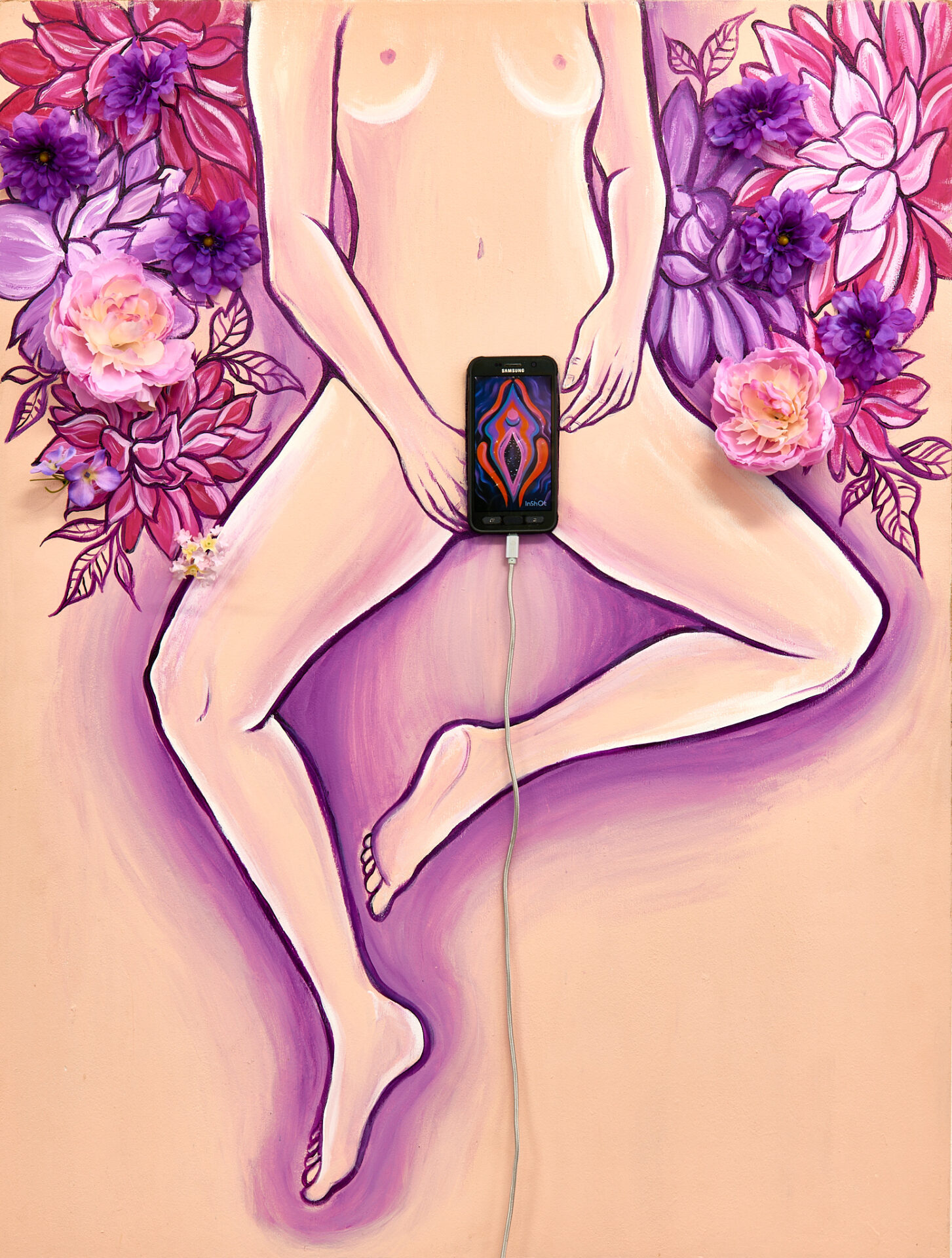
6- Tessa LeBaron | Pussy Phone | $800
Acrylic paint and found objects
2.5 ft x 4ft
Artist’s Statement: An interactive art piece with the idea of a pleasure center (the upcycled phone), empowering femininity, and to be visually stimulating. I aim to connect the parallels of the brain’s pleasure center with technology and art with a feminine twist. I decided to combine organic elements, the human body, and something we always carry with us – our phones. This is meant to convey how technology can be a tool and also “stimulate” us in various ways. Viewers can watch and swipe through different psychedelic videos and a time lapse as an interactive element.
Artist’s Bio: Tessa LeBaron is a painter and muralist who has created artwork all over northeast Ohio. She has always utilized her talents in art but decided to pursue it as a career after taking more studies of graphic design and painting at Lakeland community college. She has applied her business acumen to build her art career from the ground up.
After graduating with an applied business degree in graphic design in 2015, Tessa started utilizing her skills by printing T-shirts at “Made in Ohio” and “717 Ink” in Cleveland. She has experience in operating heat press and direct to garment machines. There, she was able to get experience with graphic production, printing and work in logo design. Since 2018, She has utilized her studio at Negative Space Gallery, hosting events and exhibitions, while fostering relationships with the community as well as in the surrounding neighborhoods in aims to help create an environment for self-expression. Negative Space gallery is a platform for the arts, supporting emerging artists and musicians, and educating inner city kids about social engagement through public art. One of Tessa’s biggest accomplishments is creating six murals located all on the same road to transform the businesses at Geneva on the Lake; which is an Ohio vacation tradition and is well-known as “Ohio’s First Summer Resort”. These murals were painted for local businesses throughout the area to brighten and beautify the space. The murals are visible to the public and can be seen driving down the strip at Geneva on the Lake.
In 2020, Tessa was commissioned to illustrate for a Netflix film; the composition book owned by Elle Fanning’s character in the movie, “All the Bright Places”. Elle Fanning’s character is a high school student and is given an assignment to write and draw about places she goes to in the movie. She is given the composition book and that’s where the artwork comes into play. The movie went on to be a success and is still streaming on Netflix. Her original artwork mainly revolves around the themes of femininity and emotional figures. Over the years, she has developed an illustrative style in acrylic painting and makes use of a palette of vibrant colors, which emote a range of feeling from fervent to tranquil. The use of seeming ‘psychedelic’ pigment can transmit a sense of joy and whimsy. Her goal is for viewers to examine how the environment can elicit a certain thought or feeling and to focus on what nature has to offer us; growth, progression and healing. Tessa continues to paint and aims to exhibit out of state and transform spaces with her art.
7- J.Travis | Beauty Shot | $200
Mixed media
18×24
Artist’s Statement: This piece is made up of reused materials from packaging paper, old acrylic pour painting, acrylic makers and acrylic paint. Beauty Shot captures all the beautiful parts from every part of my art supplies and creations of my creative process.
Artist’s Bio: J.Travis primary work as a visual artist with acrylic paint. She has experience with acrylic pour paintings, jewelry and resin. She likes to create art that sparks imagination and inspires creativity. Her favorite subjects to paint are black women and space theme paintings. She is a advocate for women empowerment and equality.
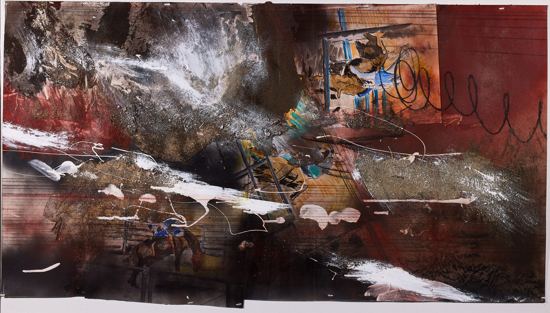
8- Eric Tuck-Macalla | Okeechobee Rodeo | $1,700
Chalk, dust, collage
44×26
Artist’s Statement: I lived in Ft Lauderdale for a time in my late teens, working as a carpenter. I fished, painted, played around in the Everglades and kind of got into rodeo while I lived there. One weekend my buddies and I drove up to Okeechobee Fla. for a rodeo. It was much bigger more serious, and raw, not the farm boy bull riding at the county fair type deal. There was a meanness in to crowd that drew me in and the “you don’t belong here” looks all around. It was thrilling, like stereotypically walking into a biker bar.
Artist’s Bio: Eric Tuck-Macalla, Cleveland based artist. 1986 graduate of Cleveland Institute of Art, BFA Sculpture. Active sculptor 1986-1995. Began creating artwork again, paintings and drawings in 2011 or 2012. Started entering shows in 2022.
High Lights:
1984 Spaces DOMO Project
1985 The May Show
1986 Nancy Dunn Memorial Scholarship recipient
1991 Group Show, Land Art Temporary Outdoor Sculpture, Ohio State University, Lima OH
1995 Solo Show The Sculpture Center
Solo Show FAVA Oberlin
2022. Group Show, “Risk and Experimentation” Woodstock Museum of Art, Woodstock NY
Group Show, “Crossing Borders” Copley Society of Artists, Boston MA
Group Show, “Drawn”, University of Indiana, Kokomo IN
Juried Show, New/Now, Highland Hills OH
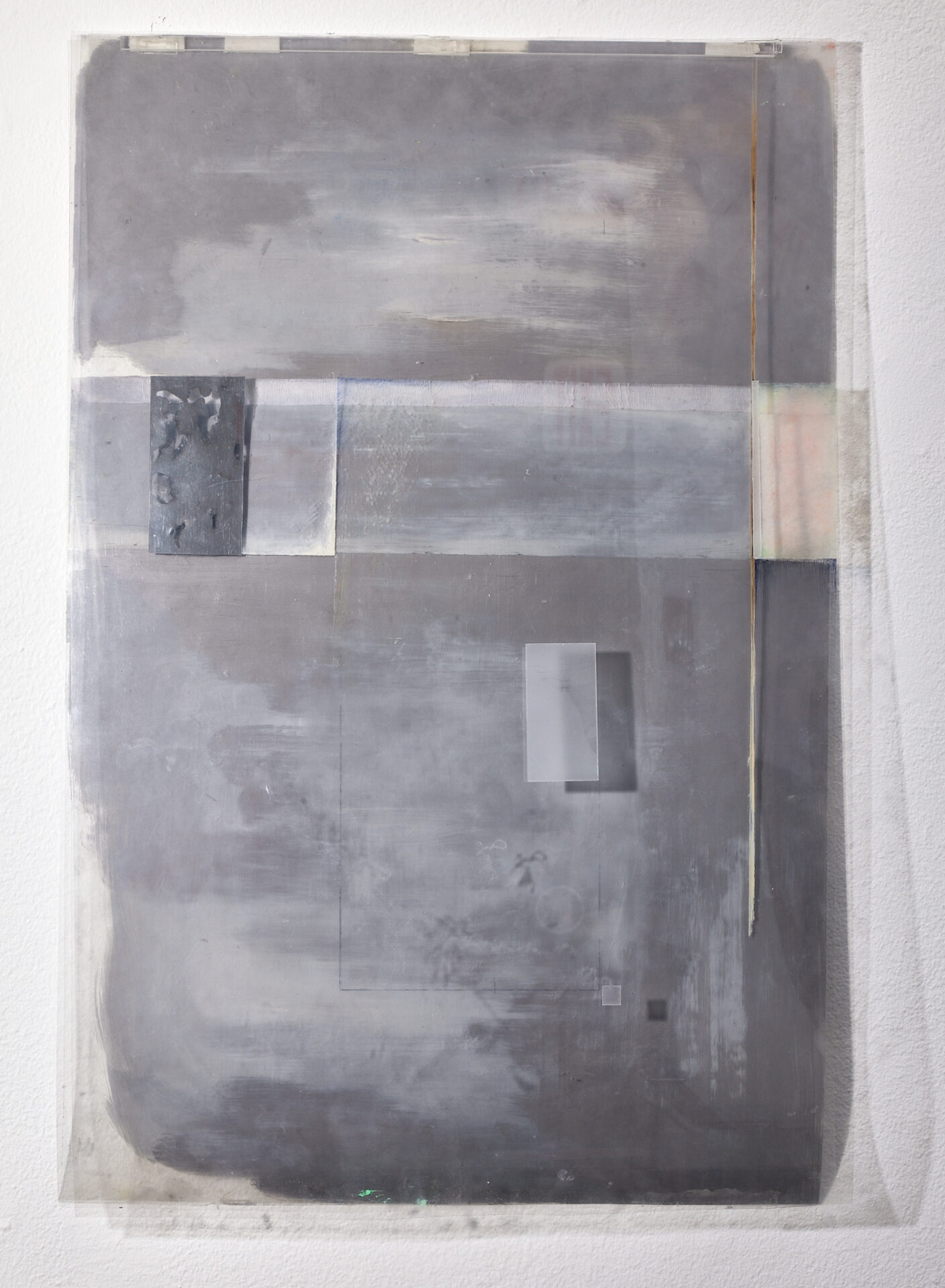
9- Ashley Strub | Stria | NFS
Oil paint, floral tape, pastel, mylar, pen, and matte medium on Dura-Lar
14″ x 21.5″
Artist’s Statement: This painting utilizes reflection and diffraction of the surrounding light to address its environment. The base layer of dura-lar is a slightly reflective paint, which changes tone based on the lighting of the space it is displayed. It consists of one segment, with only few forms deviating. The slightest suggestion of perspective is implied by the segment and deviating forms’ varying scales, but still remains extremely flat. This creates a clash between the illusion and reality of the painting. Paintings are often created to display illusion to a something that is not actually there. The embrace of the surrounding light, flatness and physical layering in this painting deny any sort of illusion – its existence is pure and unfeigned.
Artist’s Bio: Strub is an Akron native and is currently a junior studying Painting and Drawing at the University of Akron’s Myer’s School of Art. Her paintings explore invented architectural space and use substrates of varying translucency and reflectiveness to diffuse and remit physical light and address the environment they exist in.
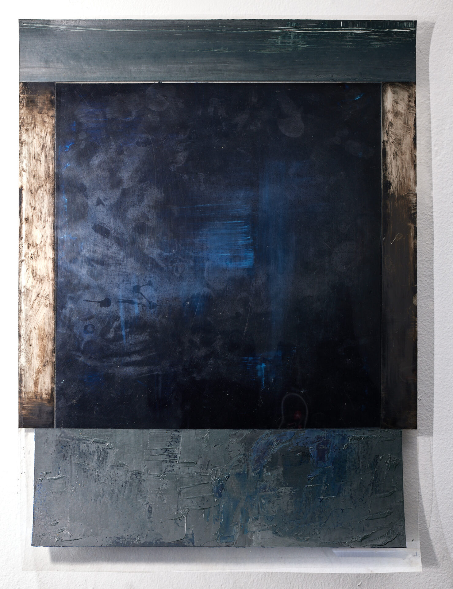
10- Ashley Strub | Void in Prussian Blue | NFS
Oil paint on Dura-Lar
14″ x 19.5″
Artist’s Statement: This painting’s minimal subject matter suggests a vacancy of some kind. The frame proposes to the viewer that something important exists within its limits, but nothing but a dark void is found. An experience like looking out a window at night. The subtly varying rectangular fields of blacks, grays and blues help to emit an emotional response. As the viewer approaches the painting it responds to their presence. The sheets of dura-lar shutter and the viewer can see their reflection looking back at themselves. Textures and evidence of paint emerge and the painting appears to hover from the wall. The experience of this painting cannot be accurately captured in a photograph, which challenges the stillness of painting and how art exists in the contemporary world.
Artist’s Bio: Strub is an Akron native and is currently a junior studying Painting and Drawing at the University of Akron’s Myer’s School of Art. Her paintings explore invented architectural space and use substrates of varying translucency and reflectiveness to diffuse and remit physical light and address the environment they exist in.
11- Steven Mastroianni | Old Systems | $1,500
Cyanotype on paper
48″x36″
Artist’s Statement: My work focuses on the intersection of drawing and photochemical processes with a series of photograms & photogenic drawings rendered in silver gelatin, cyanotype, and ink. The images straddle the abstract and surreal, drawing from the subconscious, as well as a formal and playful exploration of unique motifs and patterns. Evocative of watery depths, imaginary heavens, and mysterious maps, these luminous images create an immersive dimension with their own rules of scale and space. Like dreams, these objects seem familiar but weird; letters that don’t exist, mechanical forms floating in dark space or deep water, math problems that don’t add up, and patterns that follow their own logic of space and dimension. I want to challenge viewers on a visceral and creative level, to engage with them in the joy and energy of the imagery and patterns.
Artist’s Bio: I am a Cleveland based artist, photographer, educator, curator, and musician. My art straddles the worlds of drawing, photography, and printmaking, incorporating drawing and camera-less photographic processes. My commercial photography work includes portraits, events, and editorial photography. I am also a college professor and guest lecturer in photography.
From 2008 until 2018 I was the owner and curator of Silver Scuro Studio and Gallery (formerly Mastroianni Arts), a gallery and studio space, where I exhibited the work of area artists and other arts related events.
I have exhibited in numerous solo and group shows, curated dozens of exhibits in my own gallery, and have served on many exhibition juries. Most recent exhibitions include a solo show at Massillon Museum, Artist Residency at Akron Soul Train, and several curated small group exhibits at University Hospitals, Photocentric Gallery, and The Cleveland Printroom. My work is included in many private and corporate collections, including Progressive Insurance, University Hospitals, and The Cleveland Clinic.
12- Emily Zepp | Connection | $750
Acrylic paint on canvas
36″x48″
Artist’s Statement: In my design work, I’ve often been asked to use QR codes as they link to information quickly and easily. The client asks for them to be added onto to a document to communicate more of their own message, disrupting the page and the design. They are considered a convenient and cheap method of communication, as the creation of one is simple and free. The aesthetic of the page is disrupted to spread the client’s message. As the client and the designer, I choose not to deliver this message. What would normally be an add-on to a design or an eyesore, now becomes the central image. The human eye may be able to infer how the code should properly be constructed, but a computer is entirely literal. A camera can’t make the jump necessary to access the message hidden within the jumbled pieces. I generated the QR codes I used in this body of work with an online generator. The codes all link to various defunct websites that are no longer accessible, further emphasizing the idea of a critical disconnect.
This painting is a combination of visual languages and techniques. I used three dimensional renderings of the QR codes, but also utilized flat, black vectors. Playing with the space, the black simultaneously reveals and conceals the three-dimensional elements. The black acts as a window and a curtain to the underlying composition. In graphic design terms, the mission statement is in front of all the boots on the ground work.
The relationship with the viewer is unique. They are placed inside of the painting, looking behind the black shapes, mirroring how I was placed inside of the composition while creating it. I stood between the projection and the paint. The red and orange form in the lower right-hand corner is beveled and the blue form in the top right is expanded. The light sources for these dimensional elements are positioned differently. For the blue shape, the light appears to be coming from the top left of the picture frame, while in the red and yellow shape it appears to come from the bottom left. The varied directional light reinforces the feeling of the objects floating in a world of their own, following its own rules.
Artist’s Bio: Emily Zepp is a local Northeast Ohio artist, born in North Canton. She is in the fourth year of her education as a Graphic Designer and Painter at The University of Akron. Passionate about both art forms, she enjoys experimenting with how they feed into and elevate each other.
Starting with the desire to explore the connection between GD and painting, Zepp realized the only difference between the two is the context in which the work is created. Both graphic design and painting seek to impart messages upon the viewer and explore a certain perspective. Graphic designers improve the memorability, communication, and thoughtfulness of information and messages by use of tools like typography, photography, and illustration. The purpose of the message can be varied. However, the work is usually done for a client and is commercial in nature. Contemporary Painting is a visual process and message motivated by the creator’s intentions. Works are created by the individual artist and then sold to buyers or commissioned. While there is a commercial aspect to painting, the process and definition of painting is less rigid than that of a designer. Paintings can carry a meaning that resonates through the centuries and are often thought of as valuable fine art objects.
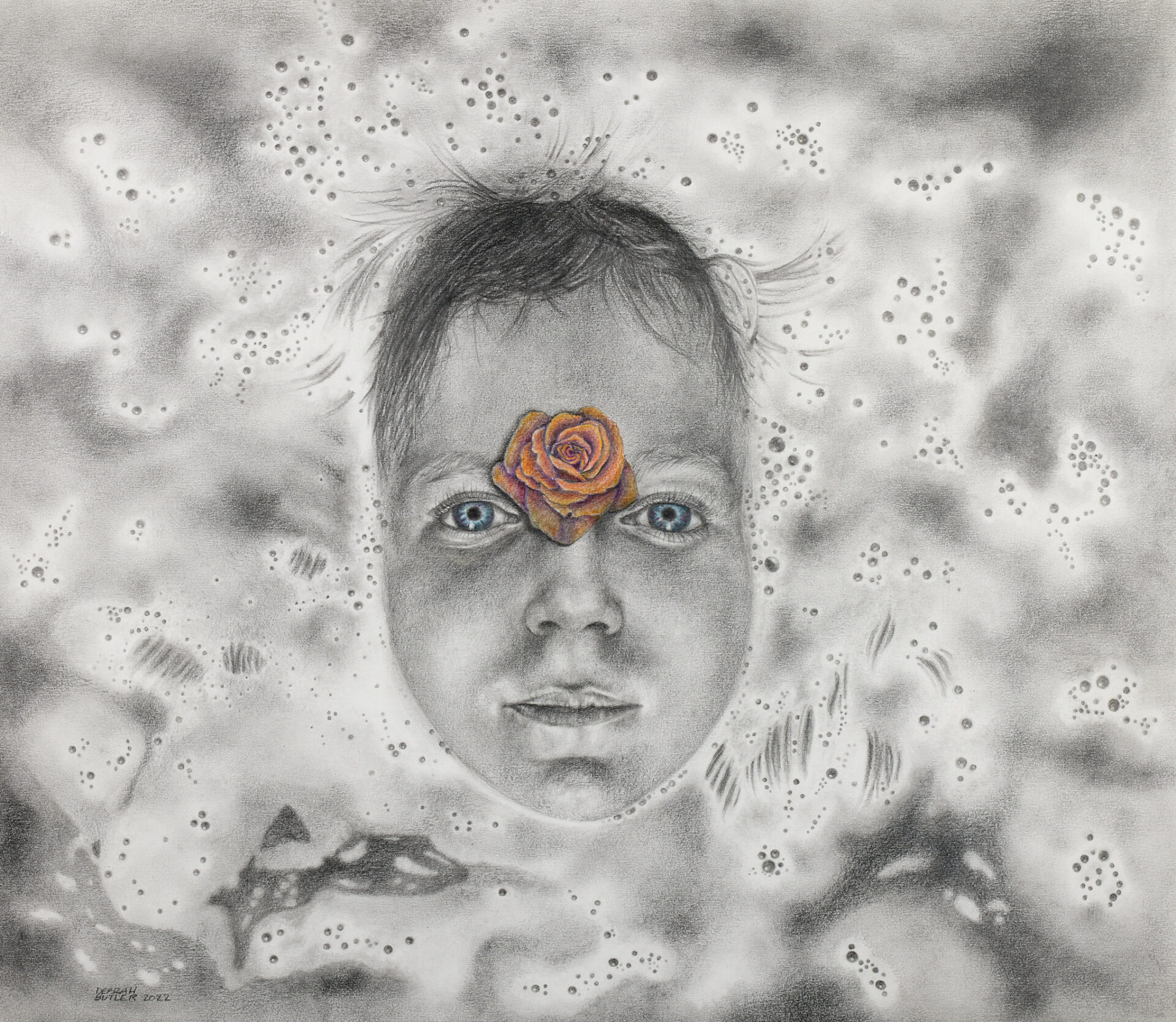
13- Debrah Butler | Rebirth of Ophelia | $1,800
Graphite and colored pencil
29.5″ x 27″
Artist’s Statement: I have always admired the paintings of Ophelia by Pre-Raphaelite painters of the 19th C. Her beauty in death; the representation of her mental innocence with flowers inspired me to create a “modern day” Ophelia, symbolizing the “third eye” with a rose.
Artist’s Bio: Debrah received a BFA from the Cleveland Institute of Art and studied with Jack Richards and Marc Moon as a student. Debrah was a founding memeber of Group 10 Gallery, Kent and has shown her work nationally including Sana Fe, NM., Salmagundi Club , NYC, The Butler Institute of American Art, and The Cleveland Museum of Art to name a few
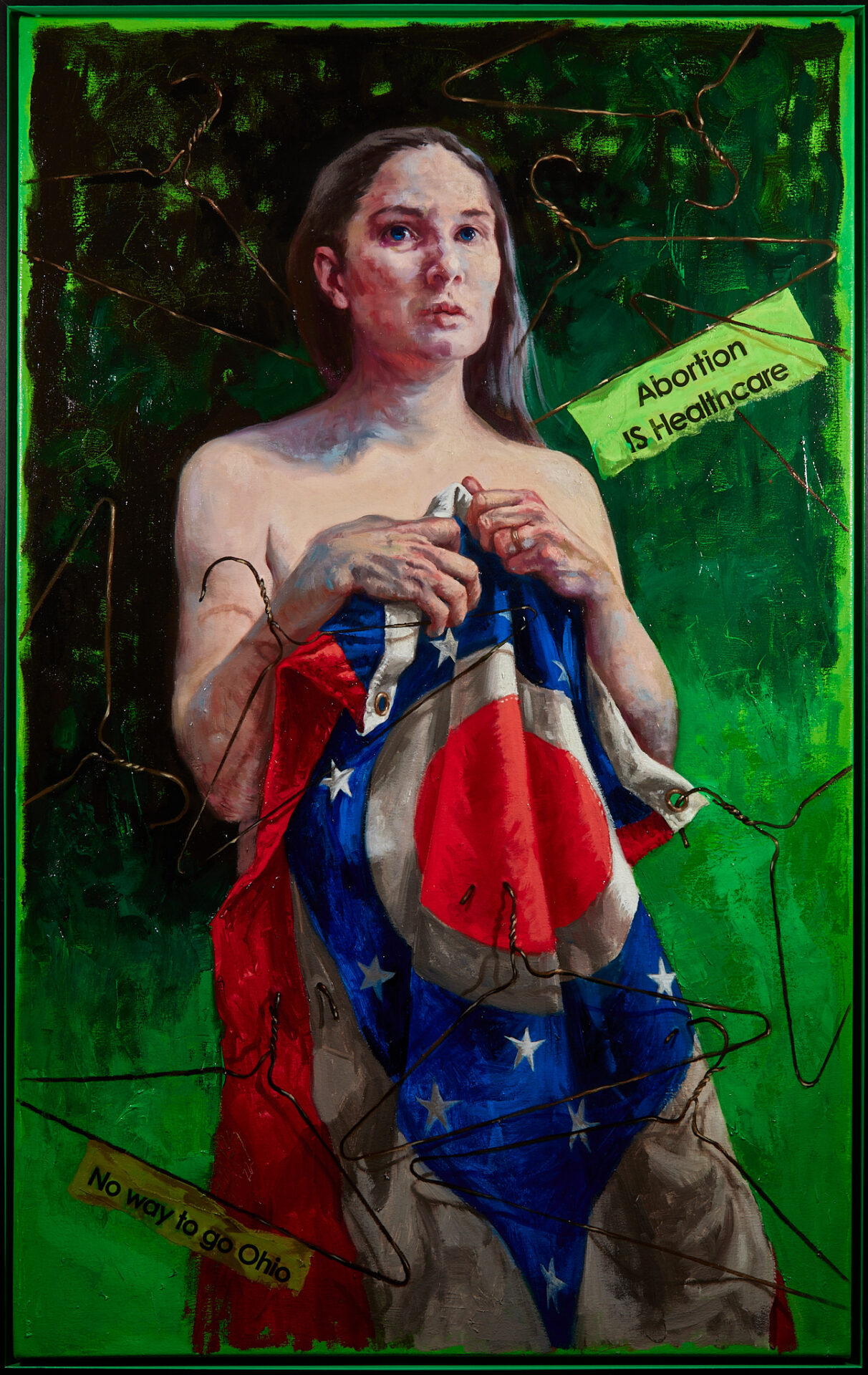
14- Judy Takács | No Way To Go Ohio | $8,000
Oil paint and collage on canvas
30 x 48
Artist’s Statement: The work submitted to Fresh is a feminist piece inspired by recent egregious upheavals in the nation and Ohio that rob women of reproductive rights and bodily autonomy. No Way To Go Ohio is a Pro-Choice painting that shows the fear experienced in this current political climate by women, children and all those who can become pregnant. The painting attempts to drive home that Abortion IS Healthcare, and the decision whether to continue a pregnancy must be made by the patient with advice from their doctor, without government intervention.
The artist has truthfully and realistically portrayed a woman who chose to pose because she is a staunch supporter of abortion rights. In a Post-Roe v Wade world, she grips the Ohio state flag as meager protection from cruel coat-hangers she had hoped were relics of the barbarous torture of Pre-Roe v Wade times. The hangers and the messages on them are expressions of the artists own activism. The artist has made trips to Columbus to festoon the Ohio Statehouse gates with hangers with Pro-Choice messages on them, and she will continue to do so, and also to paint Pro-Choice works until our reproductive freedom has been secured.
Artist’s Bio: Saving the world one painting at a time, Judy Takács is best known for the painterly realism and message of female empowerment of her traveling portrait series, Chicks with Balls: Judy Takács paints unsung female heroes, which opened at the Zanesville Museum of Art as her first solo museum show in early 2020. Her current series, The Goddess Project re-imagines mythological characters from all religions via a contemporary feminist lens.
A winner of fourteen Best in Show awards since 2011, Takács’ work has been exhibited at the Butler Institute of American Art, Zanesville Museum of Art, Evansville Museum, ArtNEO Museum, MOCA Cleveland, Haggin Museum, Salmagundi and National Arts Clubs, and at colleges and art centers nationally.
Takács holds elected and signature status memberships with Akron Society of Artists, American Women Artists, Salmagundi, Catharine Lorillard Wolfe and Allied Artists of America where she serves as Social Media Chair. Past Social Media Chair and writer for the Portrait Society of America, she has written, directed and hosted 85 episodes of Living Figuratively, her weekly broadcast, now on YouTube, designed to spur a love of figurative art. Judytakacs.com.
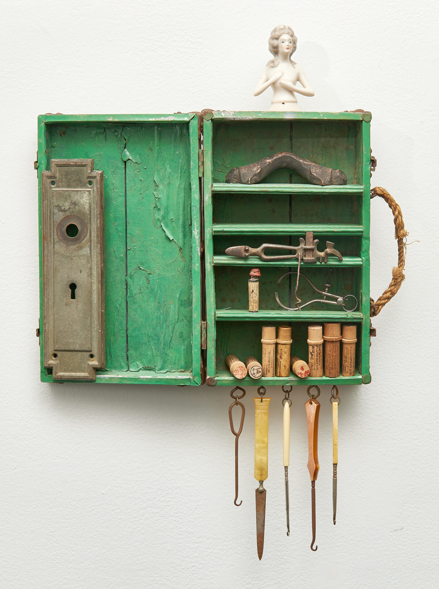
15- Elizabeth Prindle | Desparate Measures | $425
Wood, metal, ceramic, glass, and Bakelite
17.5 x 25
Artist’s Statement: This piece speaks to a woman’s right to make her own decisions about childbearing. Without access to safe, medical abortion, many women will seek “back alley” abortions or try to do their own, at great peril.
Artist’s Bio: The basis of my assemblage art is the power of inanimate objects to tell a story based on their juxtaposition. I create primarily in wood and metal materials I’ve collected from garage sales and flea markets.
Originally possessing a degree in design from Kent State University, I have come back to making art as a means of therapy, through widowhood and resolving trauma from working in healthcare. My art often explores human experiences such as birth and death; rites of passage; societal issues; sexual and domestic abuse; home, place and belonging; the loss of a child; and mental illness.
16- Cassie Hart | Sveetauk | $600
Ballpoint pen, india ink, and gouache
12″x24″
Artist’s Statement: Bodies are just vessels for our thoughts.
Artist’s Bio: In 2009, Cassie Hart obtained her B.F.A. in illustration and has since worked in many artistic fields, including jobs as a graphic designer, product designer, textile designer, and comic book artist. Her work has been shown at the ICON portfolio showcase, in the 3×3 annual, and in various group shows around the country. You may have also seen her at conventions like New York Comic Con, DragonCon, and Chicago’s C2E2. Never formally trained as a painter, she allows her paintings to evolve meditatively. Cassie’s work is constantly evolving as she experiments with medium and scale, but her focus remains on the study of the figure and the physiological expression of emotion.
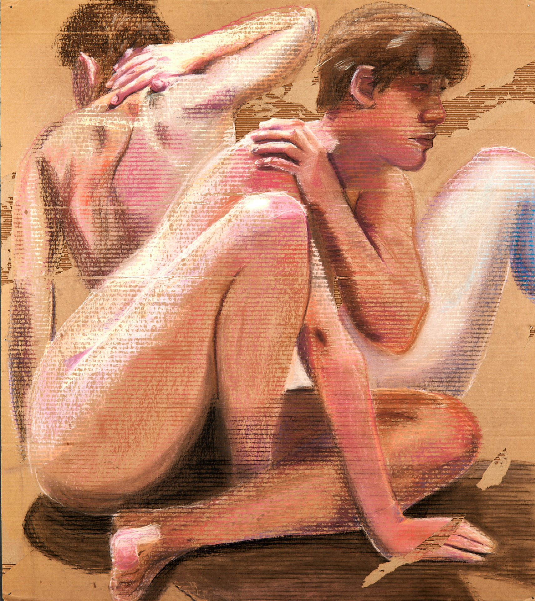
17- Moriah Clay | Me | NFS
Chalk pastel on cardboard
44″ x 39″
Artist’s Statement: This drawing is the first part of a triptych called “Me, Myself, & I.” It is a series of self portraits with each artwork representing a different pronoun and the potential meaning behind it. The first drawing, “Me”, focuses on the body. The colors are natural and the poses intend to evoke the feeling of discomfort to represent how I feel in my own skin. Chalk pastel on cardboard creates an almost ethereal effect with the corrugation showing through. I capitalized on this by only fully rendering certain areas of interest, such as hands, and leaving the rest to fade away.
Artist’s Bio: Mo Clay is an artist born and raised in Canton, Ohio. He is attending the University of Akron for a Painting and Drawing BFA. This BFA will be obtained in Spring 2022. Clay is most interested in nature themes, but he is also interested in social statements in art. He uses primarily his own photographs as reference to create paintings that highlight the artistry of nature. Clay paints both natural and figural artworks. Many of his artworks have been created to make a statement. These statements have related to current societal issues such as climate change and LGBT rights, but also mental health and stress.
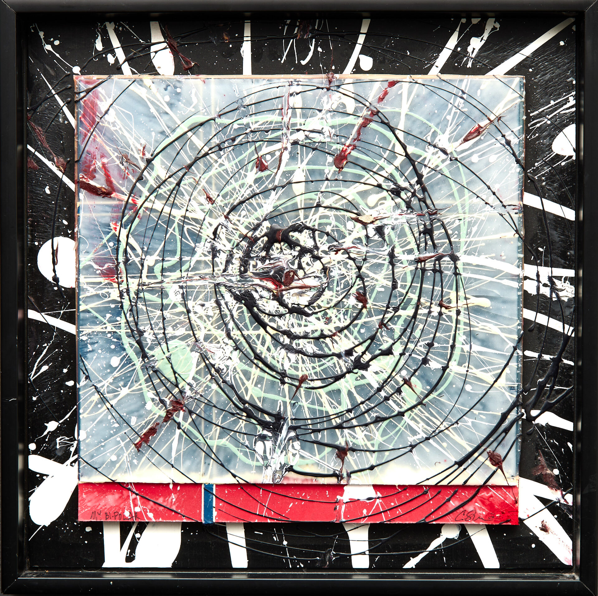
18- CHARLES SZABLA | My Bipolar | $300
Acrylic paint, paper, and glass
16″ x 16″
Artist’s Statement: I have been diagnosed with Bipolar 2. I went many years undiagnosed. This particular artwork represents with downward spiral I found myself plunging into during flareups. There is also a violent aspect to the splatter which was a syptom of the disease. btw I now have my bipolar under control.
Artist’s Bio: I grduated from the Cleveland Institute of Art in 1981 with a BFA in Illsutration and minors in Drawing and Photography. Following graduation I began a career in the graphic arts. I continued drawing and exhibiting my figurative pastels, mixed media and photography to the present day. Selected exhibitions include San Diego Art Institute–The Art of Photography Show, Ashland University–All Media Juried Exhibition, Summit Artspace–Figuratively Speaking, Lakeland Community College–A New May Show and Pen and Brush Gallery, New York, NY–Ninth International Juried Exhibition of Pastels.
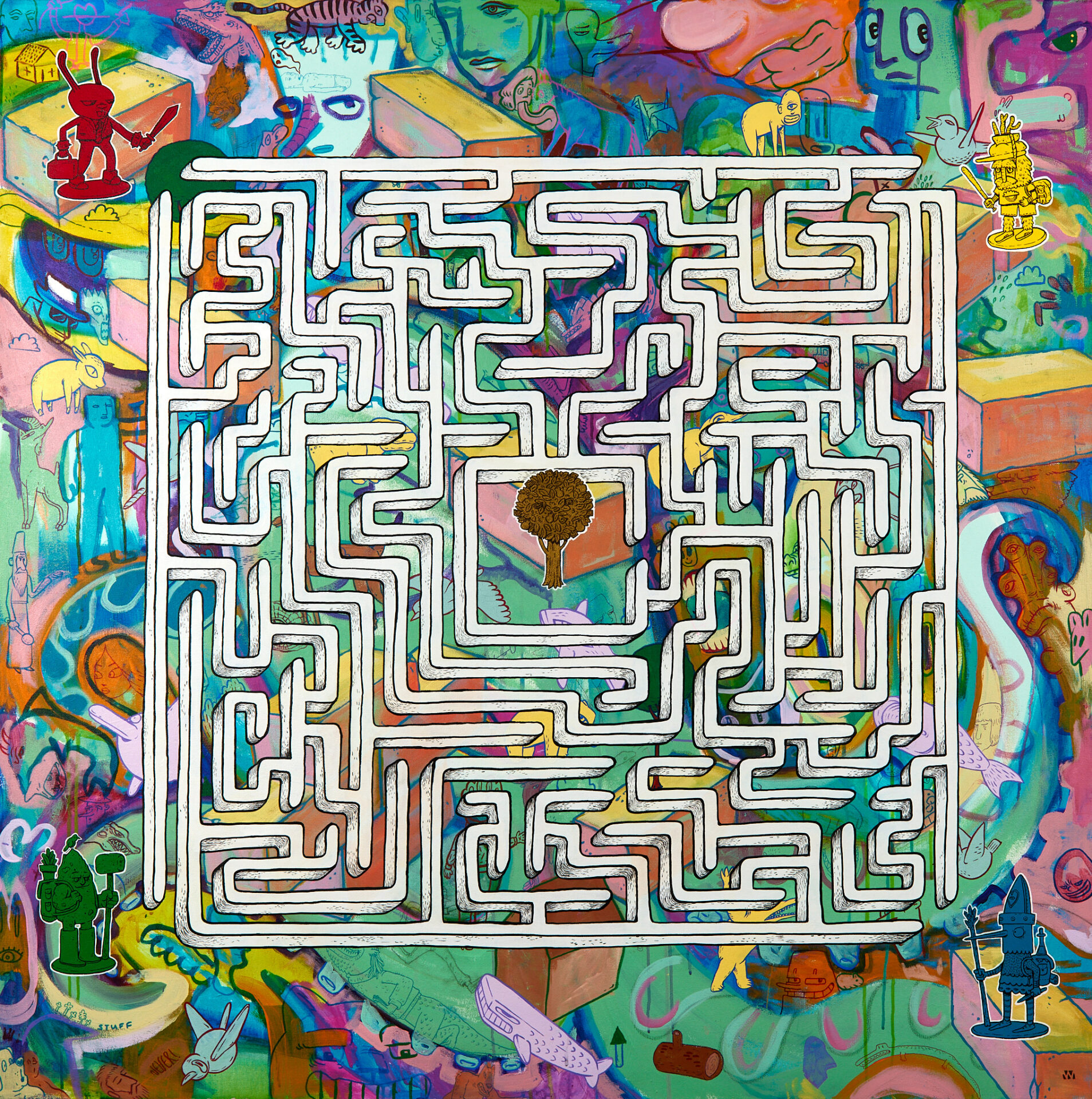
19- Will Wilson | 4 Players | $2,500
Mixed media on canvas
48″ x 48″
Artist’s Statement: Not everyone begins their journey in the same place and with the same resources and opportunities. Most of these disparities are based solely on how, where, and to whom they are born. Many people believe in the myth that anyone can succeed because there are some outliers who have. You hear phrases such as, “Pull yourself up by your bootstraps!”, Implying that a lack of success is the result of a lack of effort. The truth is, many people in challenging circumstances have worked incredibly harder than some people who come from charmed circumstances and still fail because the deck is stacked against them. Equal opportunity is not an honest promise. The greatest indicator for poverty is poverty.
Rules: Before looking at the maze, choose one of the four playing pieces, red, green, yellow, or blue. Stick with your decision and do not change. Make your way through the maze and to the center to live a healthy, prosperous life and pass that success on to future generations. All players can succeed.
Artist’s Bio:
I am interested in exploring the psychic fossils of popular culture and media exposure. Part of how I do this is by drawing inspiration thematically and stylistically from a broad range of sources. Video games, comics, graffiti, nature, and the human condition are used as starting points to create work that is bizarre and familiar. By exploring different media and styles I strive to create fun imagery that engages the imagination of people exploring it in a joyful, positive way. Ultimately, I am trying to create colorful and imaginative work that tries to make people smile.
I graduated from California State University of Long Beach in 1997. I had been in a few shows but nothing of note. After a career in finance and becoming a father I decided to change my life and move from Los Angeles to Cleveland in 2007. I became an art teacher and began focusing more on my art. I had my first real show in 2019 at RampArts Gallery. Since then I have been trying to push myself forward and sell and exhibit my work more seriously. I have had a large degree of success this year, being in 2 small works shows as a vendor, being in several group shows, being selected to participate in the Everything But the Kitchen Sink show at La Luz de Jesus in Los Angeles (and selling both pieces on display there before the opening), Being commissioned to create art for a design project at Metro Hospital by LAND Studio, being selected for a poet to respond to my work as part of the Ekphrastacy project at Heights Arts Members show, receiving a juror’s award for my piece in the May Show at Lakeland Gallery, and exhibiting as a selected CAN Triennial arts artist. I am looking to expand both the depth of my work and process as well as my reach into different markets and in front of different audiences.
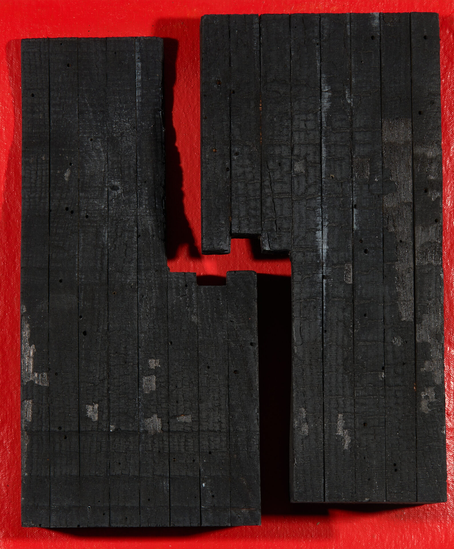
20- Kenn Hetzel | Charred on Red | $200
Charred wood, canvas, paint, wood
101/2″w x 13″h
Artist’s Statement: This work came about from my current obsession for charred wood and the texture resulting from fire.
Artist’s Bio: I was born in Cleveland, Ohio in 1948. I graduated from Maple Heights High School in 1966 at which time I started a career in retail display with Sears & Roebuck allowing me to pursue my interest in art. In 1979 I became a display manager for JCPenney which lasted until I suffered an on-the-job injury forcing me to change careers. I graduated from Kent State University with a B.A. in Art Education in 1995, a B.F.A. in Studio Art in 1996 and a Masters in Sculpture in 2004. From 1998 to 2014 I oversaw the three-dimensional program at Chagrin Falls High School, Chagrin Falls, Ohio.
Over the last few years my work and approach to sculpture has evolved to the point that I do not limit myself to the use of one material though stone is my primary medium. My work has been exhibited at the Sculpture Center, Cleveland Museum of Art, Summit Art Space, Fairmount Art Center, Rosewood Art Center, Hoyt Art Center, and Chagrin Valley Art Center.
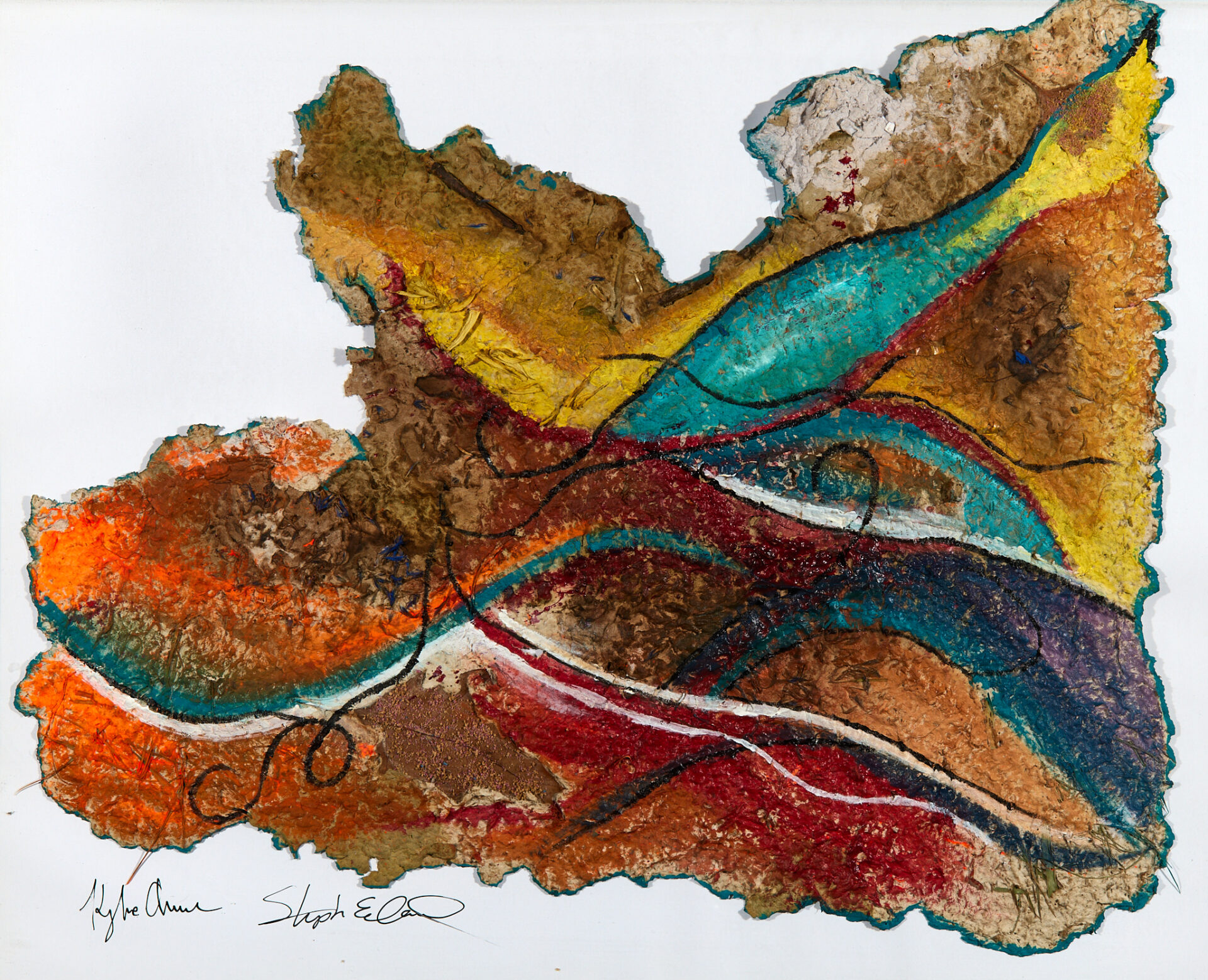
21- Stephanie Stewart & Kyla Decatur | Dust and Flowers | $250
Paper pulp, plant matter, sand, acrylic
20″x16″
Artist’s Statement: Stephanie Stewart is an acrylic artist who uses mixed media to add unique textures to her paintings. Stewart attempts to communicate the power and strength of the Black Woman through the use of bold colors and contrasting mediums. Kyla Decatur is a fiber artist and papermaker, who strives to revive the original ways of papermaking using historical techniques. Decatur uses organic matter such as plant matter, wood, and soil additives to create a pulp that is pressed and cried and formed into paper. Together, Stewart and Decatur are both inspired by their journey together as they navigate the art world developing lifelong relationships with other artists, dreamers, and patrons.
“Dust and Flowers” is a collaborative piece that incorporates both artists’ styles and techniques in an attempt to communicate the fragility of human life. Drawing inspiration from Psalm 103:14-16 where it states, “For He knows how we are formed, He remembers that we are dust. The life of mortals is like grass, they flourish like a flower on the field; the wind blows over it and it is gone and it’s place is remembered no more.” This scripture highlights the temporary nature of life in form and member. The artists used bright colors to represent the vastness through which our lifelong journey persists. The Earthly elements and paper pulp that make up the substrate represent our connection to the world. Together the artist’s choice of mediums have vividly attempted to express the complicated relationship that exists between mortality and eternal existence.
Artist’s Bio: P31 ART & DESIGN is a Christian, family-run art and design company that was created for lovers of art who are looking to add to their collection a unqiue piece celebrating the strength and beauty of the virtuous woman and her family. We create home and office products such as wall art, journals, unique wearable art pieces, and handmade stationary items. Our team is comprised of a mother-daughter duo. Through artistic expression, we take pride in ourselves as we enjoy the experience of creation and celebrate the uniqueness of every work of art.
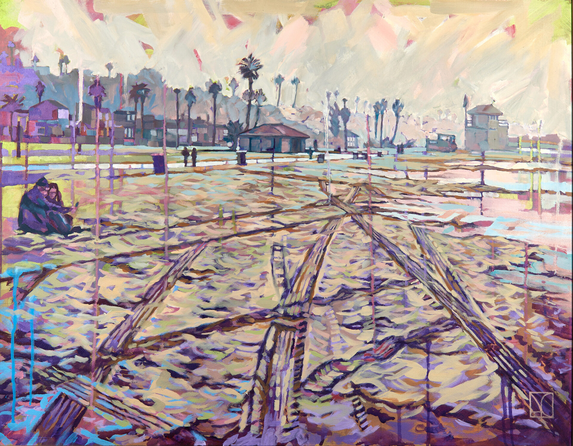
22- C. Arthur Croyle | Playa Del Rey beach in the fog | NFS
Acrylic and oil paint on canvas
28” X 36”
Artist’s Statement: Walking the forlorn empty LA beach in late fall. It had so much mood and character in the fog. The tracks leading off into the unknown.
Artist’s Bio: C. Arthur Croyle was raised in both Akron, Ohio and in Dorfen, Germany where his grandparents lived. His German grandfather was an artist and designer and profoundly impacted Croyle’s career path. Croyle completed a BA and BFA with an emphasis in graphic design and illustration at the University of Akron and worked at an advertising agency, an art studio, and a publishing company before completing his MFA at Indiana University. He then began a 33 year career as a college faculty member, culminating in a 27 year stint at Iowa State University in Ames, Iowa. During his academic career, he transitioned from teaching graphic design and illustration into the fine arts where he taught painting and drawing. Croyle was Director of the Biological and Pre-Medical Illustration Program at Iowa State and later served as Director of the Graduate Program in the Visual Arts and Culture Department. One of his career highlights was teaching four semesters in Rome, and producing watercolors and drawings that recorded the beauty of the “ Eternal City”. His work in graphic design, illustration, abstract and representational art has been exhibited regionally, nationally and internationally. Croyle is currently the Vice President of the Akron Society of Artists and is concentrating his creative efforts on representing life and subject matter in the greater Akron area.
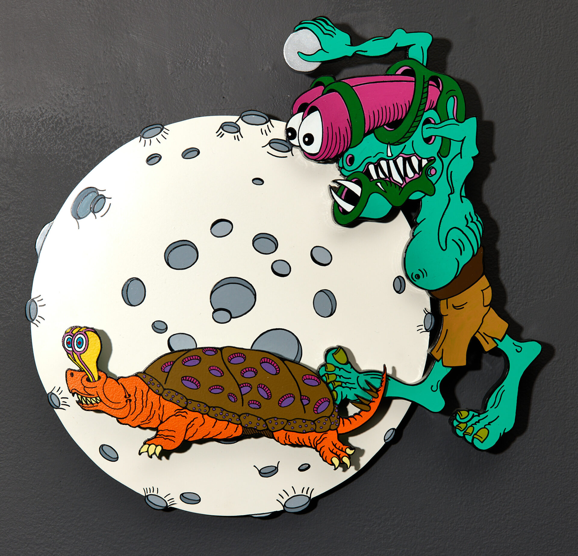
23- Victor Melaragno | SoonMoon: with Selenian Crater Shelled Turtle | $450
MDO Plywood, aluminum composite, PVC and painted with enamel
15″ x 15″
Artist’s Statement: I’ve always been drawn to anything offbeat and different, in my pursuit of art. The strange, dreamlike, weird, and experimental have always been important to me, and I take inspiration from the Lowbrow movement. Lowbrow art has been with me since before I knew the term, in the form of monsters. I’ve doodled monster-like creatures on any available surface for as long as I can remember. These creatures eventually became what I call the “SoonMoon people”, and they proceeded to infiltrate everything from cards for my wife and children to small drawings in letters to friends.
I’ve worked as a graphic artist in the sign business for over forty years now. In this time, I learned new skills I could use to bolster my artwork. My knowledge of pattern-making, sign painting, and neon work came together with my long-term interest in monsters to produce my work.
Artist’s Bio: Been doing art since I was kid and in high school was excepted into the vocational commercial art program. The course was 5 periods a day for 2 years. Went to Tri-C Metor for one year as an art student. Found a job at sign company and became a journeyman sign painter. My work is made up of the skills I’ve learned as a sign painter and maker.
24- Carol J. Stevens | Pinknyellow | $800
Water media collage
23″ x 22″
Artist’s Statement: The color combination of pink and yellow is one I’ve always felt to be unpleasant even queasy so my challenge here was to explore this perception. Creepy, crawly insects with their iridescence added to my uneasy progress toward expressing these feelings. I kept pushing my discomfort farther and farther until it ended in my sense of humor with a smile.
Artist’s Bio: Highlights: Signature Memberships from: National Watercolor Society (NWS), Ohio Watercolor Society (OWS), Kentucky Watercolor Society (KWS) Board Trustee of Ohio Watercolor Society for three terms Education: BS in Art Education from Bowling Green State University, Additional classes from the Cleveland Institute of Art and Cleveland State University 30 years of workshops and seminars with professional artists and mentors. Teaching Experience: K-8 in Lorain City Schools Various adult classes and workshops Ohio and Florida, Mentor the annual “Art and Creativity Retreat” at Sandscrest in Wheeling, WV, Selected Awards and Exhibitions 2019-2022: “ Watercolor Ohio 2022″ Sarah Kass Award, KWS: “Aqueous 2021 USA” “Aqueous 2020 USA, Cheap Joe’s Art, Silver Brush Award OWS: “Watercolor Ohio 2021”, CAC- Don Getz Award “Watercolor Ohio 2020” “Watercolor Ohio 2019”, Ohio Watercolor Society/ Blick Award Summit Artspace: “Fresh” “Kaleidoscope 2020, 2021 “Femcentric” Valley Art Center (Chagrin Falls) “50th Annual Juried Exhibit” Phyllis Lloyd Award, The Butler Institute of Art “83rd National Midyear”, Honorable Mention
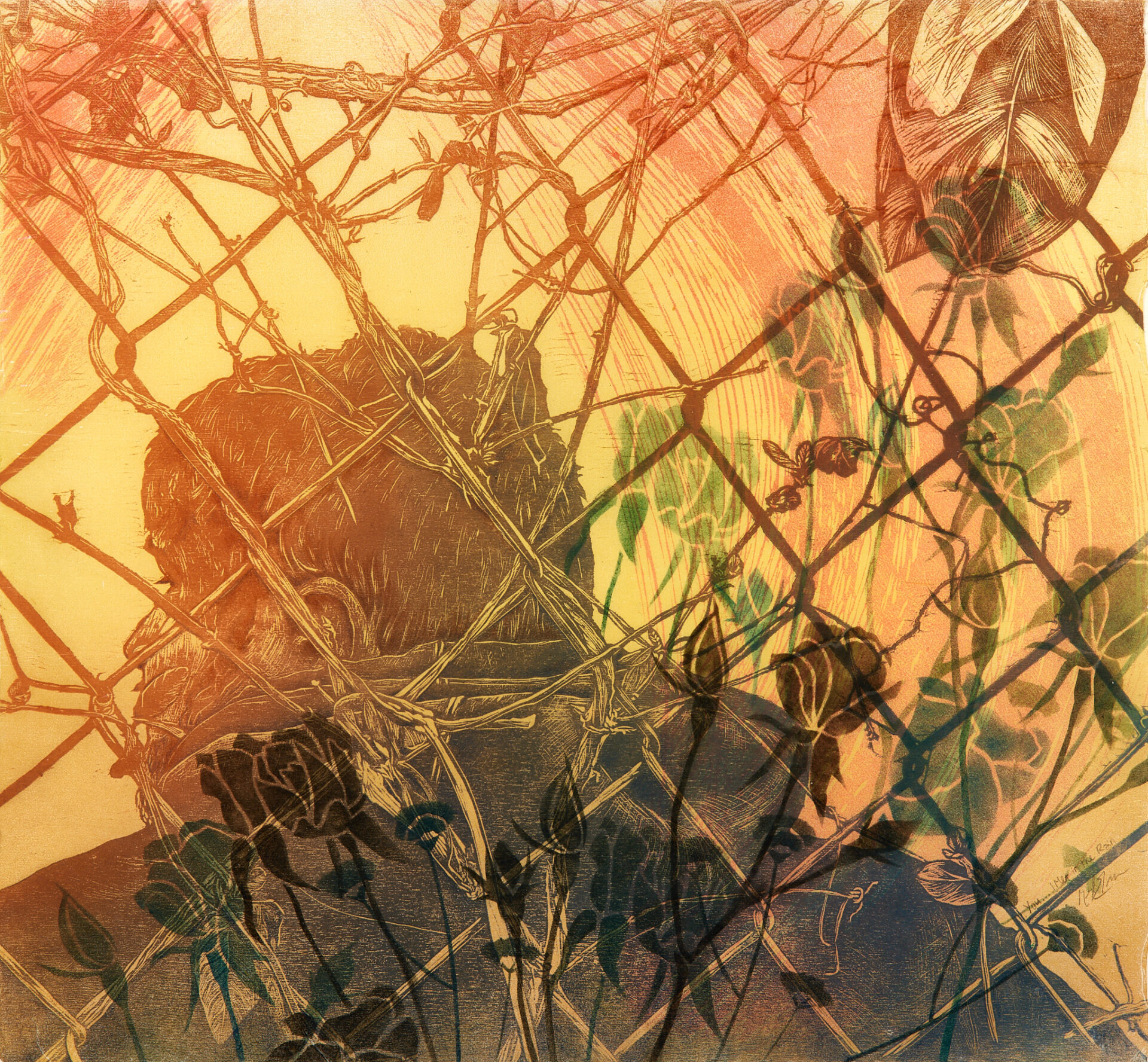
25- Meryl Engler | You…I Met In The Rain #3 | $600
Woodcut, chalk pastel
26″x24″ unframed 30″x28″ framed
Artist’s Statement: Each one of my series of works chronicles a relationship, either with a person, place or specific time period of my life. I find I can look back to a place I’ve lived and identify the type of person I was then and how I have changed. This piece started with the idea of being separated from someone I was once close to and trying to process what had happened that drove us apart. The great thing about printmaking is once I have the woodcut carved I can print it however many times it suits me and layering multiple woodblocks in various colors means that the finished print looks completely different every time. I have printed this key image three times over the course of two years and in that time many things have changed. Now, I imagine I was looking forward at the time, into an unknown future full of great possibilities.
Artist’s Bio: Meryl Engler grew up in Huntington Beach, California and moved to Akron, Ohio fall 2019. Meryl attended Syracuse University where she studied sculpture, printmaking, religious studies and history, while also competing on the women’s rowing team. Next she went to graduate school at University of Nebraska-Lincoln for studio art with an emphasis in printmaking. This is where she developed her love of colorful woodcut prints, often using pattern and repetition. She is inspired by hidden landscapes in our environment and the relationships we form to it and each other. She has shown both nationally and internationally. Meryl seeks to push the limits of printmaking and combine different art mediums in new and exciting ways.
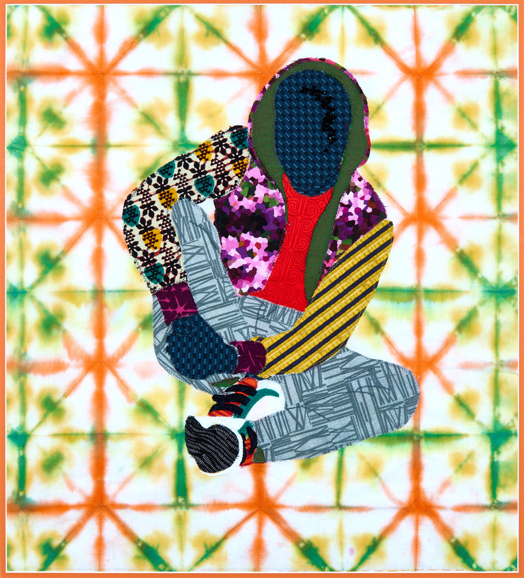
26- Muriel Tillman | My Culture is a Vibe | $825
Hand dyed and found fabrics, hand applique, hand beading, machine quilted
23.25″ x 25.25″
Artist’s Statement: My inspiration for this piece was a young man in my neighborhood. He was dressed so colorfully, well coordinated in his street/athletic wear. I call this piece, “My Culture is a Vibe”.
Artist’s Bio: My name is Muriel Tillman and I live in Akron, Oh. My interest in art, particularly, fiber arts, began at an early age. I sewed clothing with my paternal grand mother. By the age of 15, I’d made my 1st quilt. Quilting gives me such freedom of expression and joy! It is hard to describe! And so it is with this quilted piece I submit today.
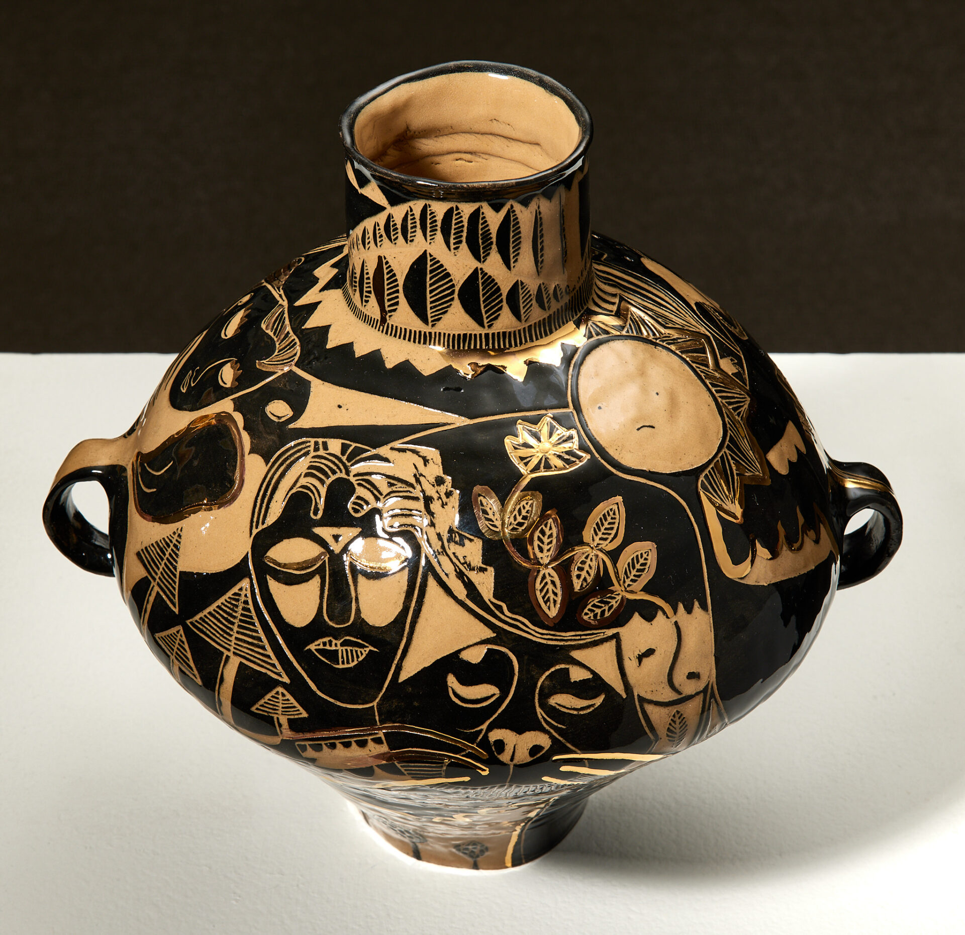
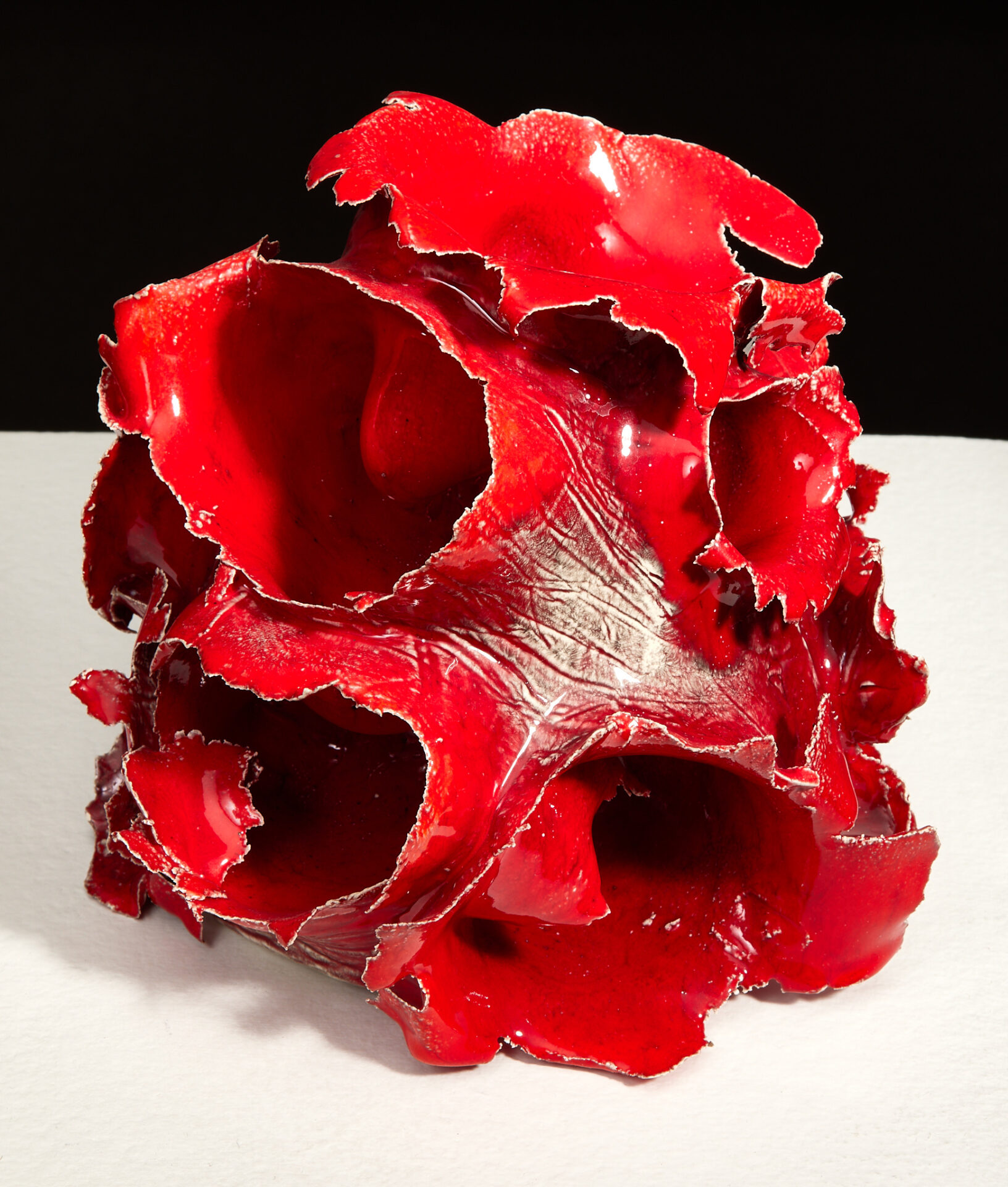
27- David Kruk | Gifts From Morpheus | $2,500
Glazed ceramic with 22 karat gold luster
13″ x 13″ x 11.5″
Artist’s Statement: In Greco-Roman mythology, Morpheus stands for the god of sleep and dreams. By shaping and forming the dream, he could appear to mortal humans in any form, allowing him to function as a messenger of the gods. In ancient Greek pottery, black and red figure imagery on the form’s surface depicted narratives of gods and heroes in reenactments of myths of the classical psyche. “Gifts From Morpheus” borrows from this traditional surface technique while abstracting imagery to imagine the whole of reality as a collective dream. Depictions of humans, animals, aliens, and botanical forms overlap and interlock to create a swirling cyclical narrative whereby each element exists within the mind of another. The form of the vessel itself hearkens back to the ancient Chinese Neolithic era, whereby pottery was decorated with intricate shapes and patterns using various colored slips and oxides, used for both functional and ceremonial purposes. By fusing traditional form, technique, and mythology with more contemporary imagery, “Gifts From Morpheus” functions as a speculative artifact from an imagined era where dreams and reality are inextricably woven together into a single modality of consciousness.
Artist’s Bio: David Kruk (b. 1992) was born in Mountain View, California before moving to Aurora, Colorado at the age of five. He received his B.F.A. in Pottery at Colorado State University in Fort Collins (2017), and has completed a post-bacc and M.F.A. in Ceramics at Kent State University in Ohio (2022). David has participated in work-study and internship programs at Anderson Ranch Arts Center in Snowmass Village, Colorado and the Archie Bray Foundation in Helena, Montana. David’s work has been exhibited in Luna Negra and Juxtapoz Magazine, and at the Curfman and Hatton Galleries, Fort Collins, CO; Companion Gallery, Humboldt, TN; Clay Art Center, Port Chester, NY; Malone Art Gallery, Canton, OH; Summit Art Space, Akron, OH; and Payto Gallery, Kent, OH. He currently lives and works in Kent, Ohio where he adjunct teaches for Kent State University and is an exhibition assistant for the non-profit organization Curated Storefront. David’s current work adopts a surrealist attitude through combining historical and contemporary aesthetics into objects that function as anachronistic artifacts in order to reflect on shifting cultural values, the position of craft within an industrialized world, and the psychology of the self.
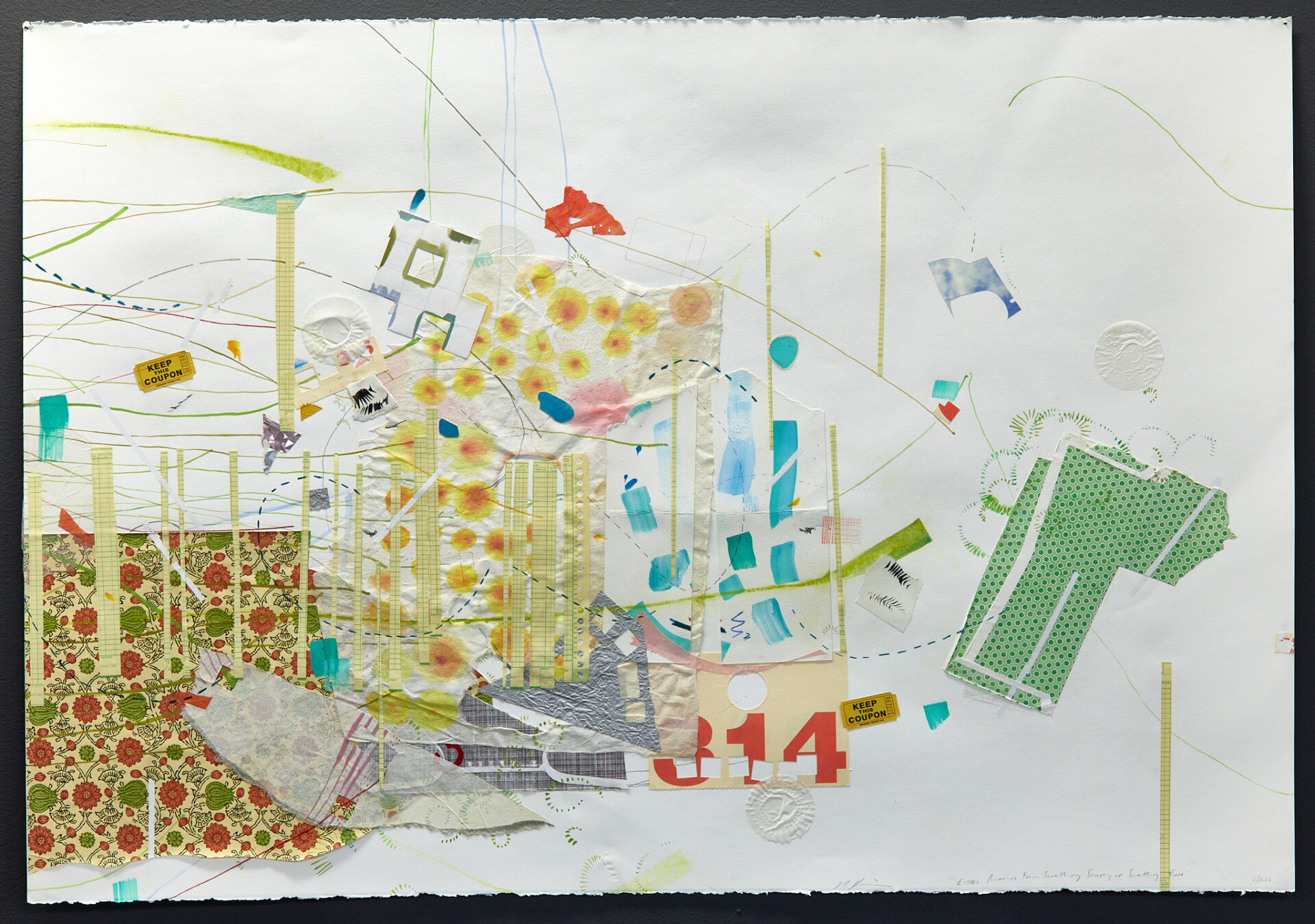
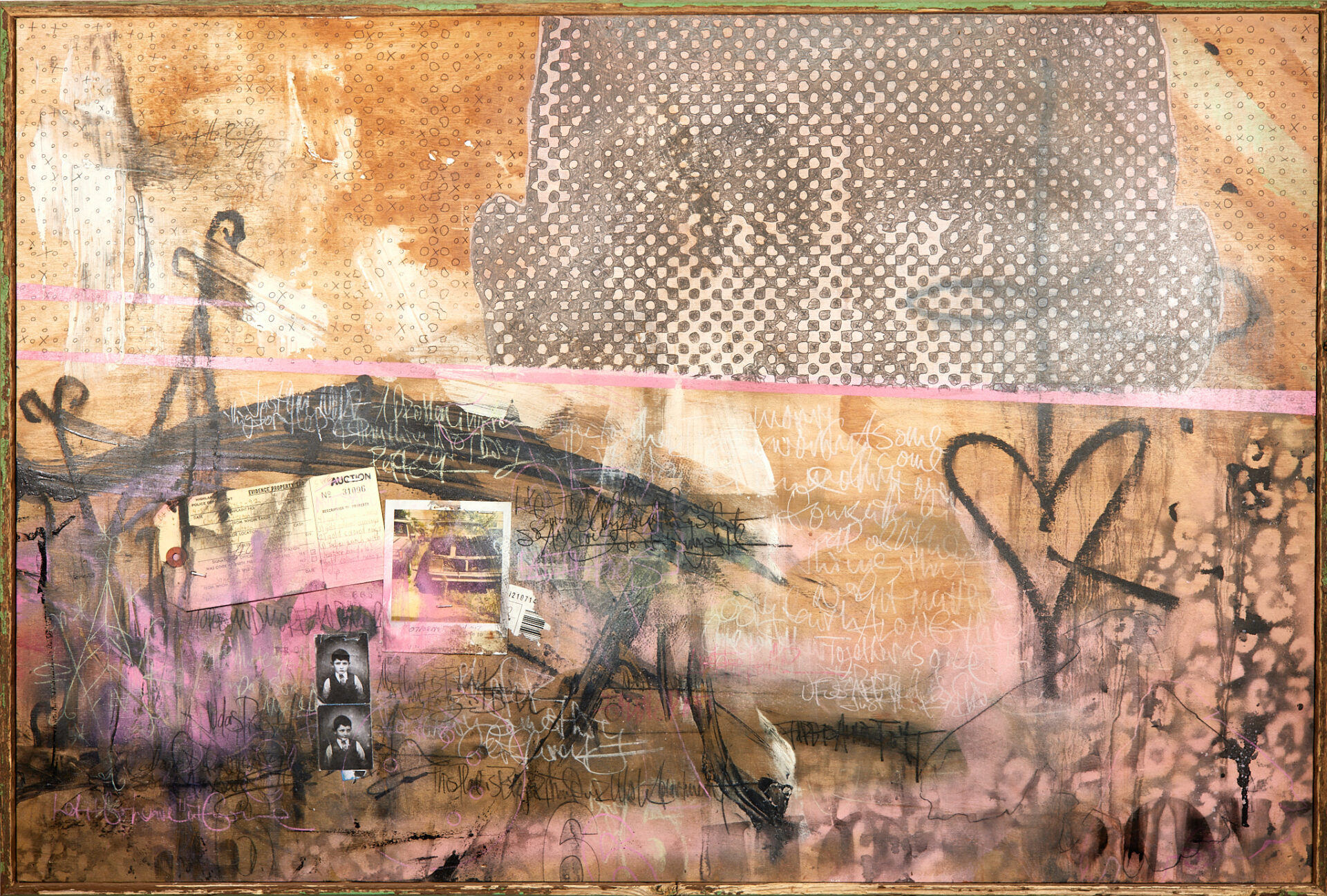
28- Debra DeGregorio | Either Running From Something Scary or Something Fun | $550
Mixed media on paper
40″ x 30″
Artist’s Statement: This work is mixed media on paper. I use an intuitive process of mark making and response to build a piece, allowing the content to emerge as the piece develops. The use of collage, pencil, ink, paint and found materials builds an autobiographical story, usually relating to a sense of self in relationship to other people and environments.
Artist’s Bio: Born in Pittsburgh Pennsylvania, Debra DeGregorio studied Printmaking and Drawing at Kent State University, Ceramics and Printmaking at the University of Akron, and received an MFA in Printmaking from SUNY, New Paltz, New York. She has taught at Kent State University, and has been a faculty member at Youngstown State University for 12 years, teaching primarily drawing. Debra has been in solo and group exhibitions in Akron, Youngstown, Cleveland, and surrounding areas for many years, including The Summit Artspace, SPACES, The Mcdonough Museum, CVA Gallery and Standing Rock Cultural Arts Center. Having lived in larger cities also, DeGregorio chose to move back to this area, thinking ‘if everyone moves to New York, what happens to the young people growing up in the rust belt?’ She currently enjoys residing and working in the community of Akron.
29- Emily Zepp | Grid 1 | $900
Image transfers on canvas
48″ x 48″
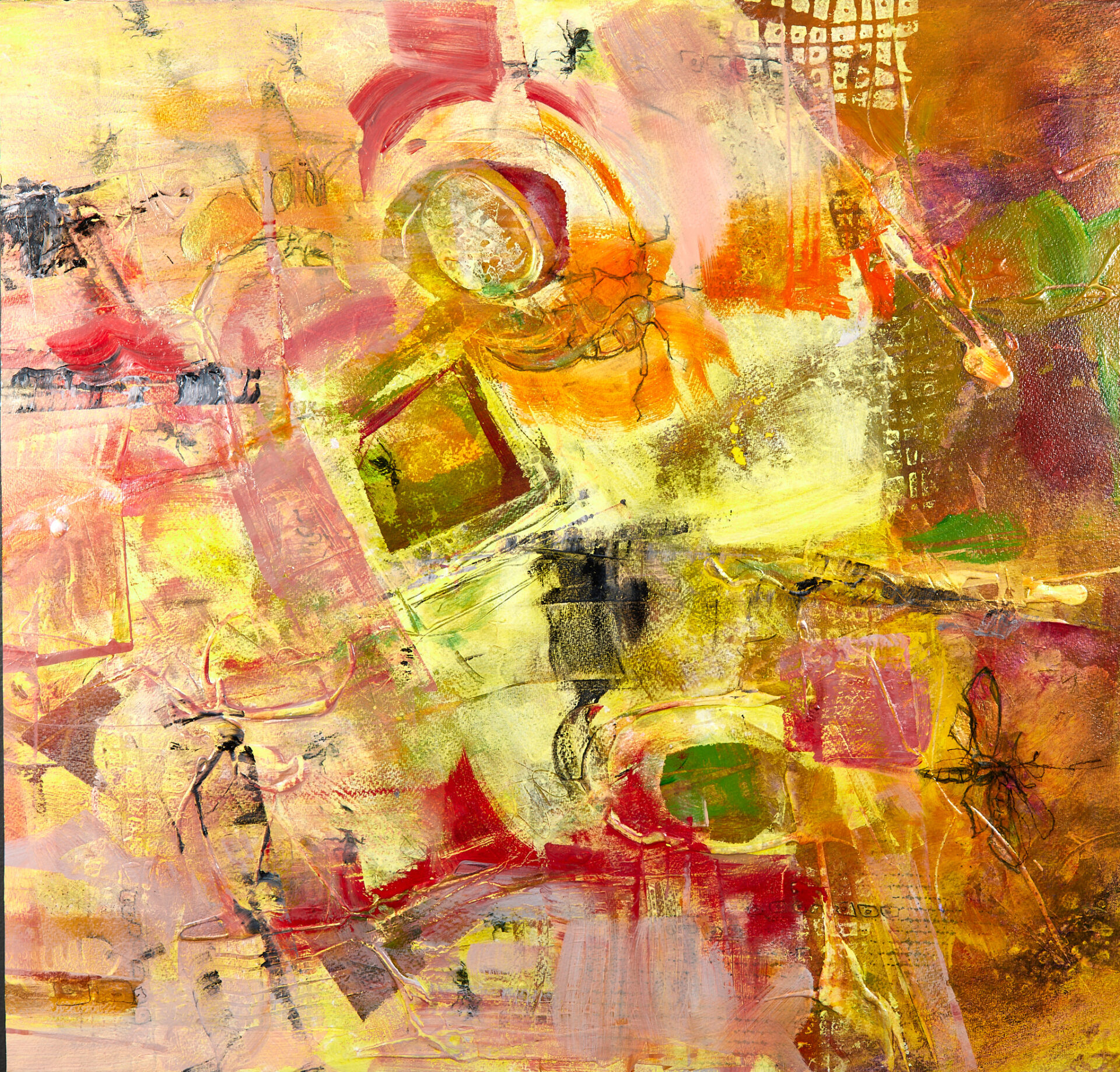
Artist’s Statement: I was interested in the creation and destruction of order and systems while creating this work. My process involved taking digital, decorative typographic assets and bringing them into the physical space. To do this, I printed out and transferred the type onto the surface alongside painted areas. The advantage of using typography is that the pattern created by the type can be easily rearranged or changed while retaining the same essential components. It’s reusable but also remixable. To a graphic designer, the decorative serves to divide the space between more visually and conceptually important areas that communicate the message. I sought to make these ornamental patterns part of the main message. My designs start as InDesign concepts where the configuration of the transferred elements is planned, and then finished on the canvas. The composition of my paintings is ruled by structure and the grid, and I work to reinforce that structure.
Artist’s Bio: Emily Zepp is a local Northeast Ohio artist, born in North Canton. She is in the fourth year of her education as a Graphic Designer and Painter at The University of Akron. Passionate about both art forms, she enjoys experimenting with how they feed into and elevate each other.
Starting with the desire to explore the connection between GD and painting, Zepp realized the only difference between the two is the context in which the work is created. Both graphic design and painting seek to impart messages upon the viewer and explore a certain perspective. Graphic designers improve the memorability, communication, and thoughtfulness of information and messages by use of tools like typography, photography, and illustration. The purpose of the message can be varied. However, the work is usually done for a client and is commercial in nature. Contemporary Painting is a visual process and message motivated by the creator’s intentions. Works are created by the individual artist and then sold to buyers or commissioned. While there is a commercial aspect to painting, the process and definition of painting is less rigid than that of a designer. Paintings can carry a meaning that resonates through the centuries and are often thought of as valuable fine art objects.
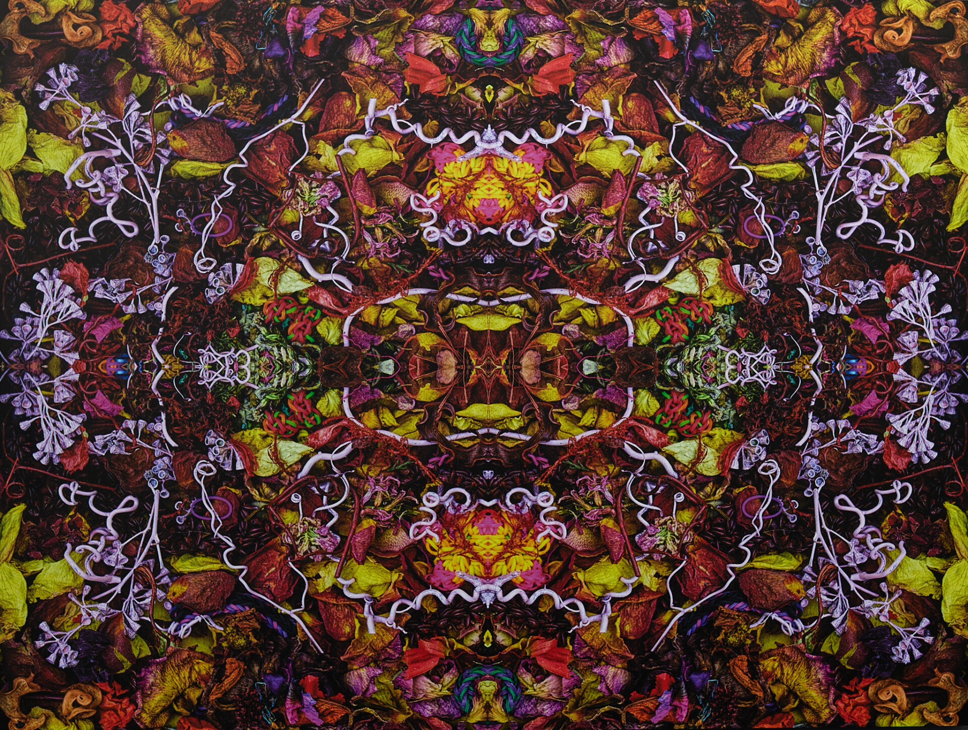
30- Stephen Calhoun | New Head Trip | $1,800
Iterated mixed process photograph printed to aluminum
30×40
Artist’s Statement: This is an excellent example of both a favored bread and butter approach, a reflective iteration of a photograph, and processing that aims to build in intrigue, felicitous tonal details, and (something like) hidden content. With pieces like this my goal is to capture the viewer and inspire him or her to explore the details, to conjure their own reorganization of what is seen, and to feel the piece’s atmosphere or vibe.
The source material is a set-up built in a box that consists of botanical materials. Some of these materials, such as grape vine windings, have been painted. Flowers come from my annual flower garden. The set-up is photographed with a digital camera pointed straight down; the bird’s eye view. This artwork shows very subtle tonal post-processing focused on the shadows and tiniest details.
From my perspective this artwork has the vibrant and busy energy of a Bruegel the Elder print or Hieronymous Bosch painting. It is also intentionally designed to sustain a surreal and mysterious aim. Because the Neverlandish and northern Renaissance proto-surrealism is a central inspiration for much of my work, these relations often are in the background of my perspective, (and hopes!)
For the viewer, the image provides an opportunity for pareidolia, the organizing of meaningful or representational content from the flux of the random and chaotic. With respect to this opportunity, it is available to viewers of any age.
Although the iteration of photographs is a perennial approach, my endeavor over a decade has been to develop an inventory of found and grown and constructed materials and to employ these resourcefully in my bodies of photographic work. How many others are doing this?
Artist’s Bio: Stephen Calhoun, born 1954 in Cleveland, Ohio USA, is a self-taught artist working in a variety of modalities, most prominently photography, mixed process new media, digital cinema, generative art, stochastic art, and, sound design. His use of technology counts him exclusively as a digital artist since 2003. (Before then he was a hobbyist painter.) He would tell you: he is an experiential artist because, “my experiments are completed by the sensitive viewers engagement and experience.”
31- Barb Moser | Blast from the Past | NFS
Clay and glaze
7 1/2″ x 6 1/2″ x 6″
Artist’s Statement: I have experimented with “blow ups” for many years and they never fail to amaze and comfort me, even when they fail. Each piece represents something from my past with each explosion representing a specific negative memory to blast away. The fagility of each piece and the negativity released, detonates my desire to continue blasting. Not knowing when or wanting to stop is what also causes some to fail, physically and/or aesthetically. Many factors influence their visual success – the potency and depth of the firecrackers, number of explosions, type of clay, water content, handling, glaze, etc.
Artist’s Bio: The complexity of ceramics intrigues, inspires, and encourages me to experiment, take risks and embrace happy accidents. Humor and exaggeration…odd and unusual objects…the peculiarities of nature…the diversity of the human form…mixed media…these are elements that define my art!
Recently retired, I now have time to explore anything and everything ART! Workshops and new media discoveries motivate me to explore diverse relationships with materials and concepts. Classes at the Canton Museum of Art led me to become a member of the Canton Ceramic Artists Guild, where I have the good fortune to work with and learn from a diverse group of artists.
Creativity lives within us all! The hours I spend creating art – considering ideas, playing with materials, and learning from the processes – are happy ones indeed. Art not only nourishes my soul but opens my eyes to new and unusual ways of seeing our world.
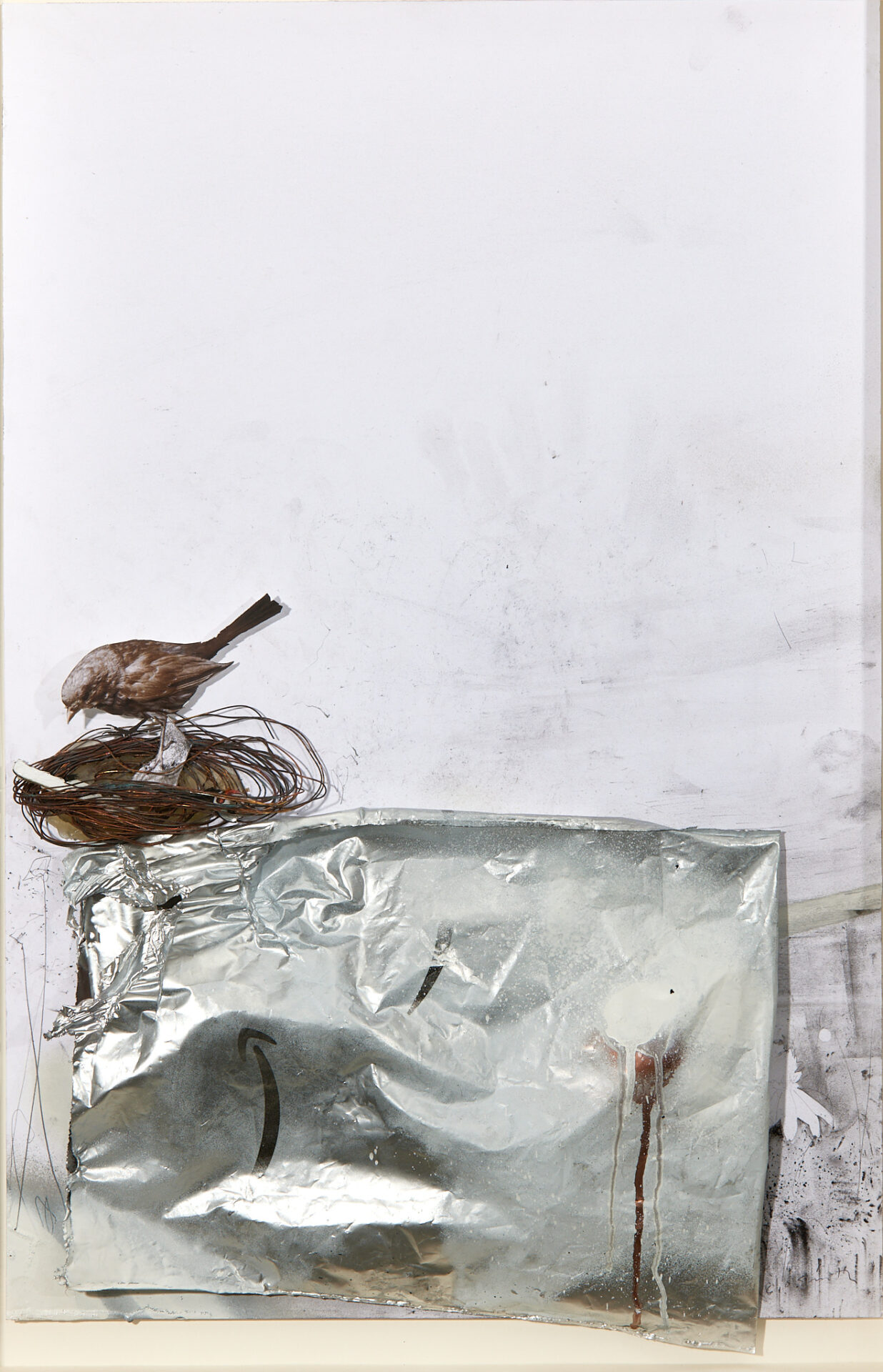
32- Christopher Owen Smith | Grab All the Shiny Things VII | $1,400
Copper wire, Amazon shipping bag, iPhone and mobile device fragments, charcoal, graphite, photography, archival digital ink, spray paint, and various papers
20-1/4” x 29”
Artist’s Statement: This piece depicts a songbird building a nest from discarded, burnt copper wire amongst a pile of used Amazon shipping bags, and in which he’s begun stashing bits of found electronic waste. The shiny materials have distracted the bird from the natural environment in the background as it stakes out new territory with less competition. The whole scene is reflective of bower bird activity, and is perhaps a new, learned trait in this species as it adapts to a harder environment filled with our waste.
The bird and scene are intended to be symbolic of both our environmental neglect and own tech addictions that distract us from more positive pursuits. The series started off fairly traditional as 2-dimensional renderings but continues to go into more constructed, 3-dimensional dioramas containing pieces of my old mobile devices and shipping waste as a personally cathartic acknowledgment/release, and repurpose of otherwise unusable materials destined for landfills.
Artist’s Bio: Born in 1969 (Columbus, Ohio), I’ve been making images since I was young and did my academic studies at Columbus College of Art & Design and the Pennsylvania Academy of the Fine Arts in Philadelphia. Afterward, I traveled to Japan for Soto Zen monastic training at Shosoji and Bukkokuji, and a sculptural/ceramic apprenticeship with Kakuho Saito-san in Fukui prefecture. Following a cross-country road trip in 1996 I made my home in Northeast Ohio where I have side-by-side careers as professional artist and gardener.
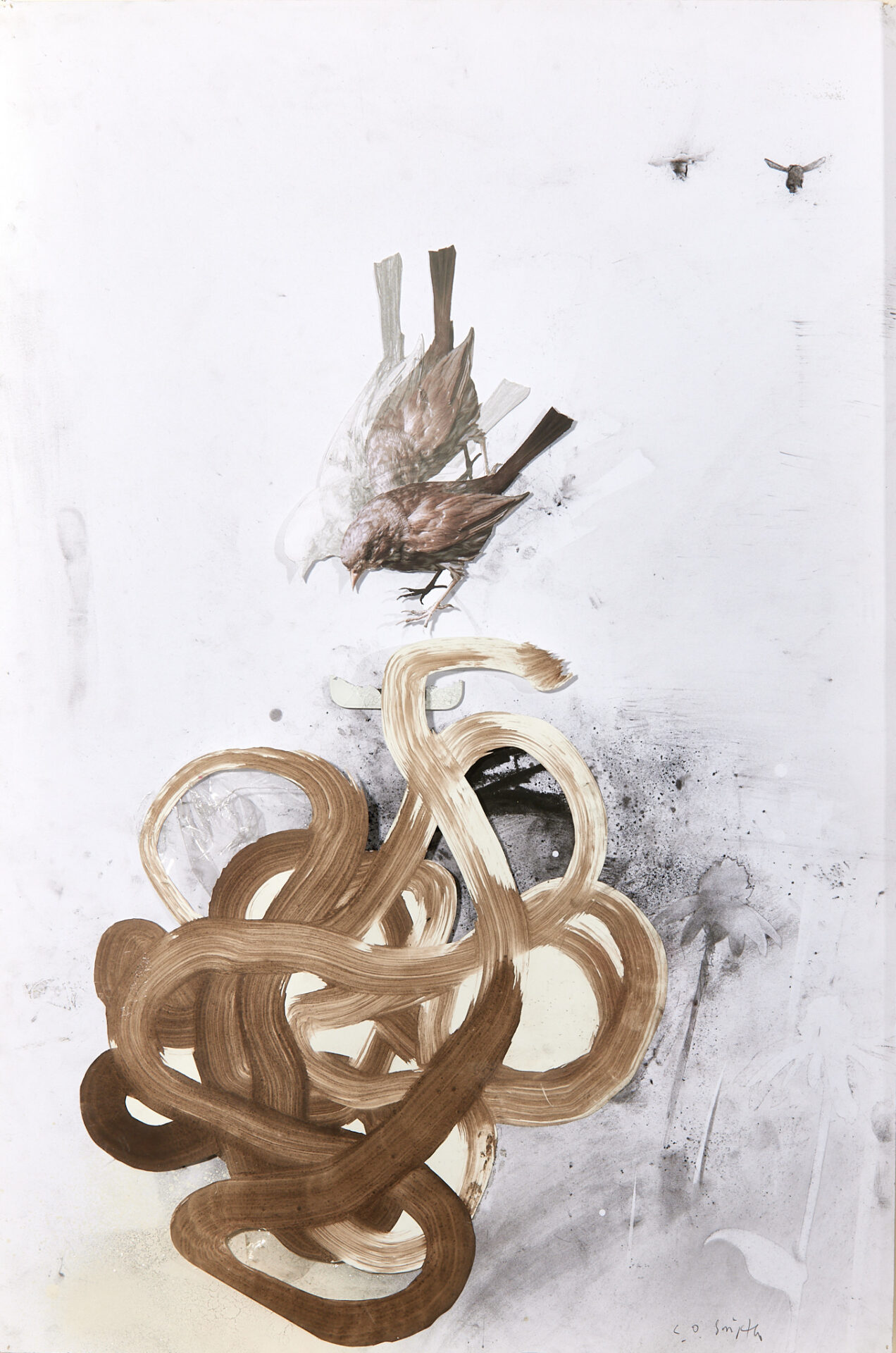
33- Christopher Owen Smith | Grab All the Shiny Things VI | $1,400
Homemade black walnut ink, charcoal, graphite, photography, archival digital ink, iPhone fragment, spray paints, plastic, and various papers
20-1/4” x 29”
Artist’s Statement: This piece depicts a bird in motion that’s going for a fragment of a broken and discarded iPhone, but is in danger of being entangled by ribbons of a torn shopping bag that’s swirling around in a wind funnel (often seen at the back of urban and suburban parking lots where the wind gets caught up between buildings, and where flora grows in spite of the harsh environment).
The bird and scene are intended to be symbolic of both our environmental neglect and own tech addictions that distract us from more positive pursuits. The series started off fairly traditional as 2-dimensional renderings but continues to go into more constructed, 3-dimensional dioramas containing pieces of my old mobile devices and shipping waste as a personally cathartic acknowledgment/release, and repurpose of otherwise unusable materials destined for landfills.
Artist’s Bio: This piece depicts a bird in motion that’s going for a fragment of a broken and discarded iPhone, but is in danger of being entangled by ribbons of a torn shopping bag that’s swirling around in a wind funnel (often seen at the back of urban and suburban parking lots where the wind gets caught up between buildings, and where flora grows in spite of the harsh environment).
The bird and scene are intended to be symbolic of both our environmental neglect and own tech addictions that distract us from more positive pursuits. The series started off fairly traditional as 2-dimensional renderings but continues to go into more constructed, 3-dimensional dioramas containing pieces of my old mobile devices and shipping waste as a personally cathartic acknowledgment/release, and repurpose of otherwise unusable materials destined for landfills.
34- Eric Tuck-Macalla | Man in Black | $3,500
Chalk, concrete, fiberglass resin, with styrofoam on paper
44×60”
Artist’s Statement: My work is inspired by snippets of memories. When I was a kid, I loved Johnny Cash. “The Man in Black”, his song about standing up for the poor and oppressed was one of those songs that really touched me, it still does.
The memory is of visiting Washington DC with my parents and siblings, I was somewhere between 9 and 12. We must have arrived in the middle of a protest cause there were throngs of colorful people and signs, I was dazzled. Once or twice I caught sight of large men with guitars strung upside down across their back dressed completely in black, I always saw them from behind. Knowing the song I knew they were costumed in protest, I remember the deep black against the color and the symbolism of standing up for the poor and oppressed. A lot of my work comes from these places, old industrial neighborhoods, hollers, trailer parks, there is a poetry there.
Artist’s Bio: Eric Tuck-Macalla, Cleveland based artist. 1986 graduate of Cleveland Institute of Art, BFA Sculpture. Active sculptor 1986-1995. Began creating artwork again, paintings and drawings in 2011 or 2012. Started entering shows in 2022.
High Lights:
1984 Spaces DOMO Project
1985 The May Show
1986 Nancy Dunn Memorial Scholarship recipient
1991 Group Show, Land Art Temporary Outdoor Sculpture, Ohio State University, Lima OH
1995 Solo Show The Sculpture Center
Solo Show FAVA Oberlin
2022. Group Show, “Risk and Experimentation” Woodstock Museum of Art, Woodstock NY
Group Show, “Crossing Borders” Copley Society of Artists, Boston MA
Group Show, “Drawn”, University of Indiana, Kokomo IN
Juried Show, New/Now, Highland Hills OH
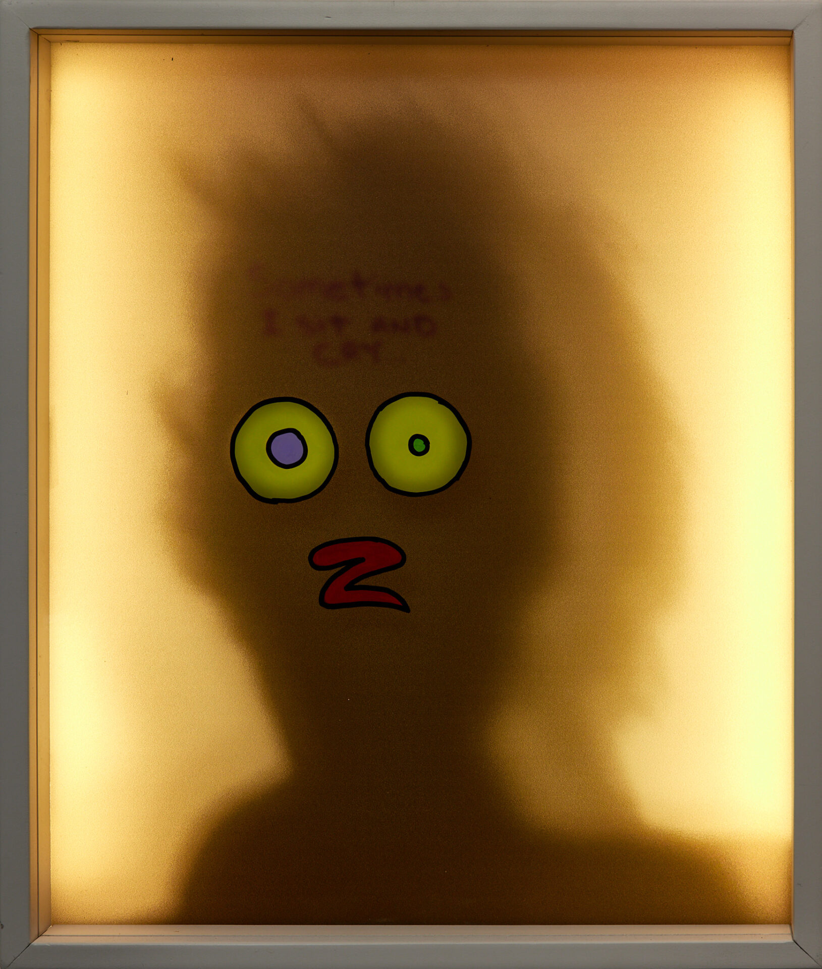
35- m | Self Portrait (sometimes i sit and cry) | $750
LED lighting, inner dialog, shadow transparency, acrylic paint and clear acrylic
16″w x 20″ h x 3-1/2″ d
Artist’s Statement: I have been exploring identity for the last 2-1/2 years using my cell-phone to take self portraits, except not of my image, but my shadow. My shadow self. I have then incorporated iconic facial features from my past work or my possessions in these shots to define the image and hence the identity. Since my iconic facial features are readily recognizable as mine, isn’t that a form of my identity? And are we not identified by our possession? I have recently been interested in the differences with the image we portray to the world and the image we have of ourselves. They may or may not be the same. If someone knew what was going on in my head vs. what I allow the to see, would they view me differently? In this particular piece there are three layers: The inner dialog which casts a shadow on a transparency of my shadow (essentially a shadow on a shadow), and my iconic facial features (the image of myself that i present to the public).
Artist’s Bio: m is a national artist with solo and group show in California, Illinois, Michigan and Ohio.
36- Sarah Leemaster | Porch 02 | NFS
Photo transfer, trace monotype, acrylic paint, and oil paint
48” x 48”
Artist’s Statement: This body of work focuses on the use of line throughout interiors and architecture, while also maintaining line as a formal art element. Lines created by the interiors and architecture that surround us directly interact with the space it occupies. The natural environment and architectural forms find themselves engulfing one another. The intersections provide visually interesting lines—one based on organic forms while the other geometric. As a result, the relationship is based off contradictions. The body of work focuses on the relationships created by these intersections and how they contradict each other.
Beginning with a dark ground, a photo transfer was done. As a result, a sense of dark, deep space was achieved. The darkness was emphasized using oil paint while a trace monotype was used to break up the dark space. Geometric planes of translucent color were added to create a sense of fragmented space. These spaces become intertwined with line work. Overall, the work focuses on creating a space that leads to nowhere; while the lines find themselves engulfing one another at the same time. Highlighting these elements reference the relationship between architectural forms and the environment it surrounds.
Artist’s Bio: Leemaster’s paintings focus on personal experiences, domestic interiors, and linework. She does not limit herself to either abstraction or pictorial depictions but finds a balance between the two—creating a field of ambiguity that allows the viewer to create their own narrative.
Leemaster is interested in the use of line as a method to guide the viewer across a work. These lines may be intersected with domestic interiors, transferred images, or other lines to create a composition. She also explores the relationship between architecture and domestic interiors/exteriors, and how these relate to nature and human relationships. Juxtaposing organic and geometric forms, a sense of abstracted space is achieved.
Using both direct and indirect methods, the planes merge into each other yet a sense of deeper space appears within.
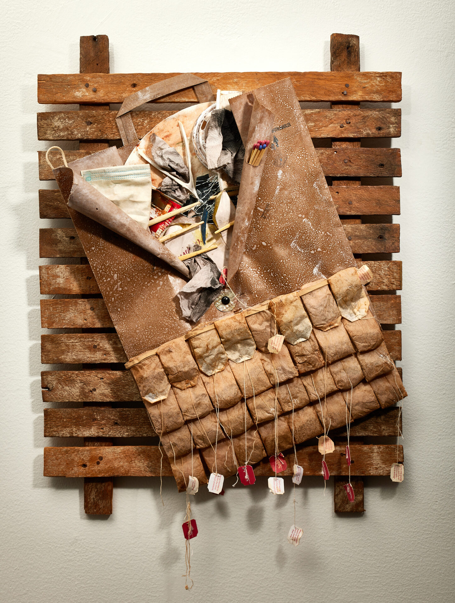
37- Lou Camerato | Found | $300
Assemblage
18″W X 24″H
Artist’s Statement: This assemblage titled “Found” contains layers of metaphors referencing a variety of issues in today’s society: gun control, gender identity, human rights, environmental changes, racism, stress, political conflict, and government accountability are just a few. Many people in our post-COVID country have become fractured from the increasing disregard of individuals in our society. Externally, we sometimes
Artist’s Bio: Lou Camerato (he/him)
Lou Camerato, a resident of West Akron, creates found object assemblage art with items he stumbles upon in various venues. He selects items because they speak to him on some level with a hidden message “take me home”. He refers to his creations as visual journaling; conveying his thoughts visually. Lou also creates in other mediums as well such as acrylic, collage and sometimes combines these mediums into his assemblages.
Lou attended Hartford Art School at the University of Hartford. After leaving art school in search of more reliable income, he pursued a degree from Central Connecticut State University in accounting and finance, which led to an extensive career in the field peppered with sporadic periods of artistic creation.
In 1994, Lou moved with his family to Canton, Ohio, growing more active in the art world in the late 1990s. In the early 2000s, moved to Akron and continued with assemblage art until about 2004. Lou again ebbed from creating art to focus on raising his two children and pursuing other opportunities in the financial world. In 2021, upon making moves for his retirement after 47 years in business finance, Lou rebranded his art studio – Just Another Bright Idea Productions – and jumped back into more creative time. Since then, he has continued creating unique assemblage and mixed media works.
Throughout his artistic career, Lou has participated in various juried and non-juried exhibits and has won several awards. He is often part of many Northeast Ohio art shows as well. Lou’s work has been exhibited at the Canton Museum of Art, The Massillon Museum, Little Art Gallery in North Canton, Summit ArtSpace, the Gallery at Lakeland Community College, Middle Earth Gallery in Cuyahoga Falls, Peninsula Art Academy, Akrona Gallery and Hazel Tree Gallery, Akron. He is a member of Akron Society of Artists, Artists of Rubber City, SummitArtspace, and more recently the National Collage Society.
You can view Lou’s work at is Instagram account Lou.Camerato.Art an also contact him by e-mail at jabi5858@gmail.com
38- Scot Phillips | We do, in all honesty… | $2,000
Oil paint, acrylic paint, colored pencil, found objects, and framed in found wood
37.5″x25″
Artist’s Statement: I am trained as a screen printer and work primarily as a commission mural painter. Most everything I do is very refined – there is a specific process. I have, for years, strived to take my “hand” out of my work and create things that appear to be made by a machine – or screened process. My murals are mostly photo realistic halftone images. I have dialed my screen printing process in to once again remove any gestural hand. Working in this way has consistently made me feel increasingly tense, boxed-in, and trapped. My psychological issues have both birthed some of this behavior of “everything has to be perfect” and made me that more perceptive of why I operate the way that I do. My OCD and anxiety have been, artistically, a blessing and a curse that I find myself teetering between. This piece specifically – “We do, in all honesty…” has come from many hours of self-reflection. This piece operates as a “breaking away” from my norms of highly-representational imagery. I felt, that in the context of “FRESH” for me, no other piece would imbody that that this. I have pushed my limits in many ways. I usually have a plan – this piece did not. I usually finish relatively quickly with commissions or paintings – this has been manipulated for over a year. I have been slowly embracing a dirty, used, rotten, and found material aesthetic. This all has come out of an need for me to break out of the boundaries that I have been set up for myself in habit and psychologically. This piece is still me, though. It has halftone, though my hand is much looser, and a color palette I still frequent. I have left myself in so many marks in this piece. I’ve operated in a way not trying to complete a vision, but live within the means of this exercise.
Artist’s Bio: My name is Scot Phillips and I am the owner and operator of 25th & Lincoln Mural Company. I am also the Operations Officer at the Massillon Museum. Along with my wife Sandi, we have been painting murals for more than 12 years and have in-depth experience working with contractors, companies, non-profits, and municipalities on large-scale projects. Our work often utilizes hand-painted halftone. This process is often used in screen-printing, however in our murals, every single dot is drawn and painted by hand. From a distance, the human eye blends all the dots together to create the image. This technique is time consuming, but the results are striking.
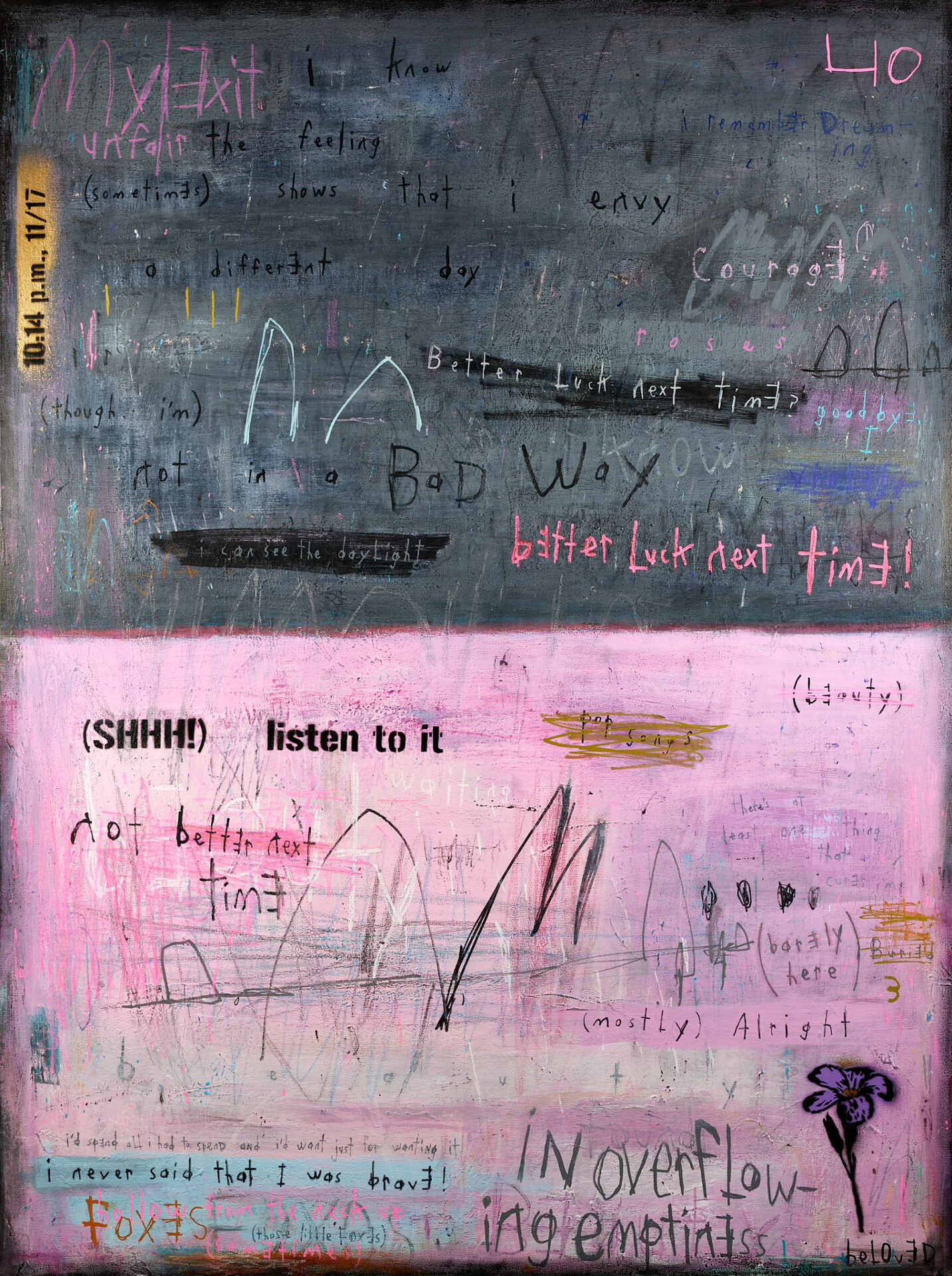
39- Ja Miller | Wasting Away in the Best of Times (We Go on Dancing Nonetheless) | NFS
Acrylic, crayon, and hand-cut stencil graffiti on canvas
36″ x 48″
Artist’s Statement: Wasting Away in the Best of Times (We Go on Dancing Nonetheless) is a visual and emotional response to the song “Not in a Bad Way,” by Ryvoli. Stylistically, it is an abstract expressionist work influenced by street art and using words and language as art. Thematically, it explores the tension that exists when we find ourselves navigating or trapped in moments of life known as “liminal spaces.” These disorienting seasons often leave us hanging uncomfortably in transition, often forcing us to tread water somewhere in-between storms and safe harbors.
My work is heavily influenced and inspired by music and Ryvoli’s song “Not in a Bad Way” served as my primary inspiration and source material for this piece. My research for this painting took a fresh turn as I was able to connect with Sam (and Jenn) from the band through a mutual friend. This is the first piece I’ve done with an inside perspective from a song writer on the story behind a song that provoked me to create a work of art. Though our small collaboration, I ended up with several short but precious audio journal entries from Sam. She thoughtfully answered questions I had and offered honest reflections about the pain and hidden beauty behind her song. The painting contains some of those moments, as well as my reflections as I spent time listening to the song and Sam’s recordings.
Whenever we speak to an artist directly about their work, it connects us to their art or music in a new and more intimate way.
My hope is that this painting reveals my story (one that is rooted in many long years of chronic pain), while also re-telling a bit of the story Sam shared with me too. In the end, perhaps our collective voices have a song worth singing to someone else who is searching for some bravery as they face the hard and often lonely road that leads, sometimes slowly, through liminal spaces.
Beyond Ryvoli’s “Not in a Bad Way,” this work was also influenced by mewithoutYou’s “9:27 a.m., 7/29”, “My Exit Unfair”, “O’ Porcupine”, and “A Glass Can Only Spill What It Contains.”
Artist’s Bio: Hawaii-born Ja Miller is a Korean-American abstract expressionist and filmmaker, who has lived in Akron since 2003. Abstract expressionists Gerhard Richter, Jason Craighead, Taylor O. Thomas and Ty Nathan Clark have strongly influenced him, as well as street artists, Blek Le Rat and Shepard Fairey, and filmmakers, Jim Jarmusch and Sophia Coppola. Music plays a big role in inspiring Ja’s art and he considers mewithoutYou, Comrades, Tina Boonstra, and Sonic Youth particularly influential. Ja’s films have been accepted into Flickerings Film Festival, Highland Square Film Festival, and The Akron Art Prize Film Festival. His paintings have been accepted into a number of past Summit Art Space’s Fresh Art Exhibitions. Professionally, Ja is a filmmaker, photographer, and graphic designer. He studied photography and graphic design at Indiana Wesleyan’s School of Art.
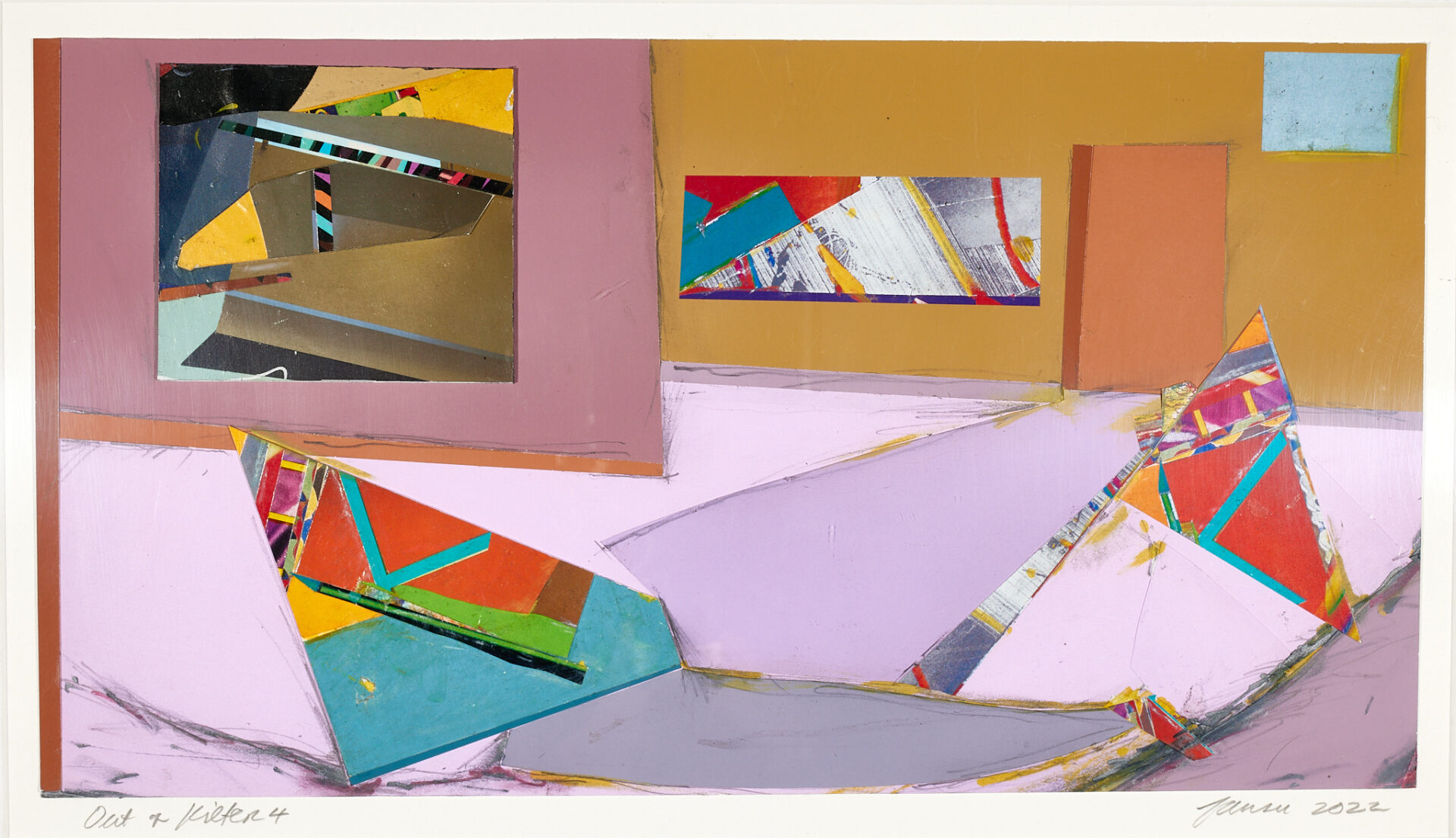
40- Jeff Fauser | Out of Kilter 4 | $425
Mixed media on paper
22″x 16″
Artist’s Statement: This piece is one of a series of twelve using the idea of manipulating color and shape into a slightly suggestive hint of interior space.
Artist’s Bio: see at grouptengallery.com
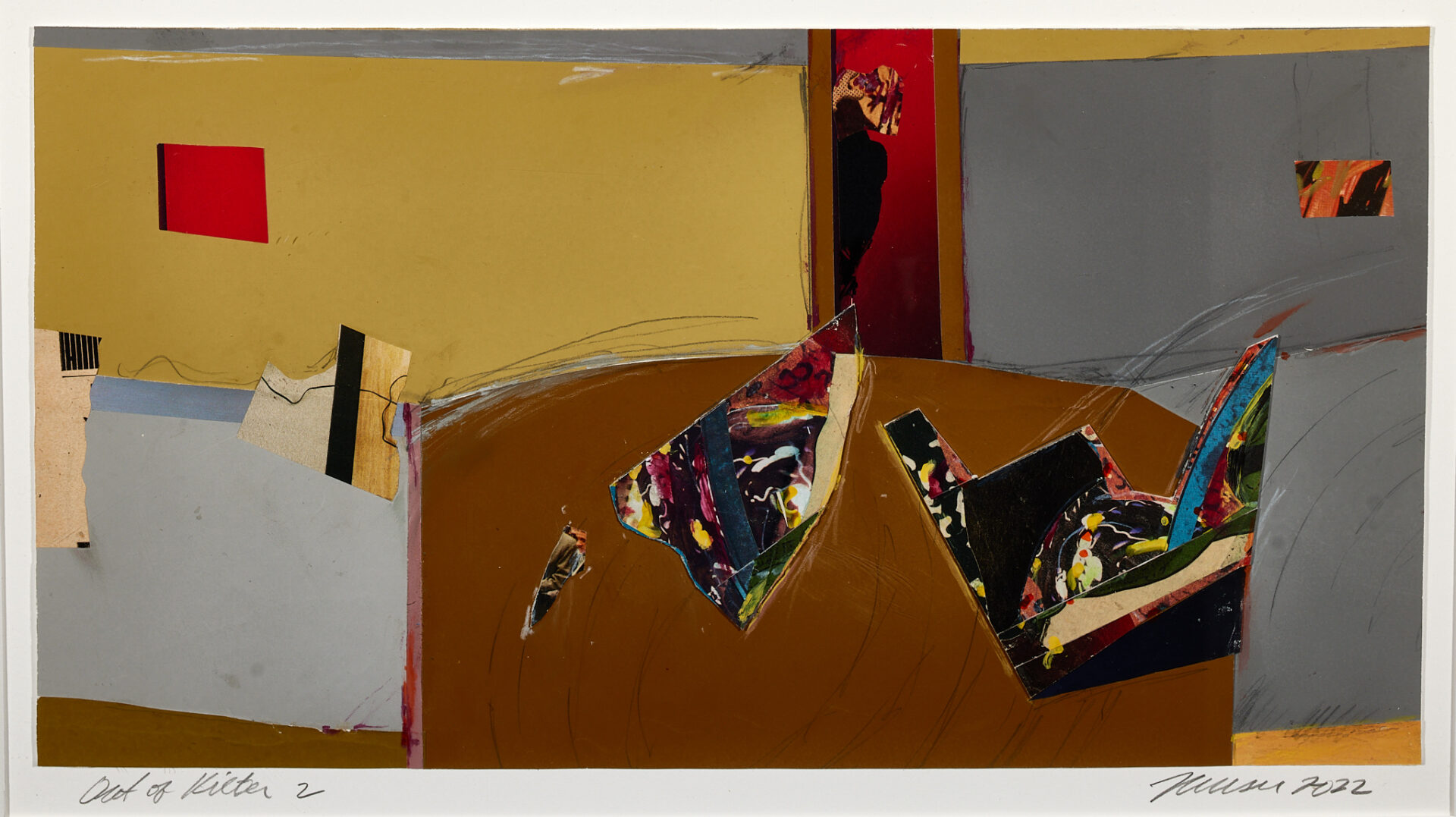
41- Jeff Fauser | Out of Kilter 7 | $425
Mixed media on paper
22″x16″
Artist’s Statement: This piece is one of a series of twelve using the idea of manipulating color and shape into a slightly suggestive hint of interior space.
Artist’s Bio: see at grouptengallery.com
See the Summit Artspace exhibit schedule for show details.
Have questions? Here is our Frequently Asked Questions page.