Logo Standards
Full logo
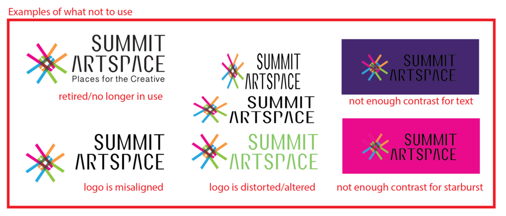
- Always choose the most legible option with the most contrast
- Do not alter/distort aspects or colors of any part of the logo
- “Summit Artspace” should always be in either black or white
- Use white “Summit Artspace” on dark backgrounds (dropshadows acceptable)
- Use black “Summit Artspace” on light backgrounds
- Starburst can be used alone but “Summit Artspace” should always have the startburst
- Try not to put logo on background color the same as one of the four main accent colors (Green, Pink, Blue, or Orange)
- Use full color version unless printing in black in white
- “Places for the Creative” logo is no longer to be used
Starburst
- Always choose the most legible options with the most contrast
- Do not alter/distort aspects or colors of any part of the logo (rotating is acceptable)

Media Contact
Media Contact
Media may contact Heather Meeker , Executive Director, with questions.
Email: heather@summitartspace.org
Phone: (330) 376-8480 ext. 2
Social Media and Website
Follow Summit Artspace on social media: Instagram, Facebook, Twitter, LinkedIn.

